
Boxplot with data points on top of it is often better visualization technique than the boxplots alone. This is mainly because, boxplot with data points actually shows the data underlying the boxplots, while the boxplot alone just shows the summary statistics. Always remember, … [Read more...] about How to Make Boxplots with Data Points using Seaborn in Python
How To Make Simple Heatmaps with ggplot2 in R?

Heatmaps are a powerful way to visualize multi-dimensional data. By representing numerical values as colors within a matrix, heatmaps allow us to spot patterns, clusters, and outliers instantly. For example, you might visualize high values in a dark color and low values in a … [Read more...] about How To Make Simple Heatmaps with ggplot2 in R?
How To Make Boxplots with Data Points in R using ggplot2?
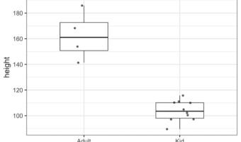
Boxplots with data points are a great way to visualize multiple distributions at the same time without losing any information about the data. In this tutorial, we will see examples of making Boxplots with data points using ggplot2 in R and customize the boxplots with data … [Read more...] about How To Make Boxplots with Data Points in R using ggplot2?
Change Axis Labels, Set Title and Figure Size to Plots with Seaborn
In this post we will see examples of how to change axis labels, how to increase the size of axis labels and how to set title for the plot made using Seaborn in Python. These three are most basic customizations a plot needs to make it useful. Let us load the packages we need to … [Read more...] about Change Axis Labels, Set Title and Figure Size to Plots with Seaborn
How to Make Pairplot with Seaborn in Python?

When you have multiple variables you might want to quickly look at how each variable is distributed and how each variable is related to other variables. Basically, we are interested in histograms of each variable and scatter plots for all pairs of variables. Seaborn's … [Read more...] about How to Make Pairplot with Seaborn in Python?