• Skip to primary navigation
  • Skip to main content
  • Skip to primary sidebar

Data Viz with Python and R

Learn to Make Plots in Python and R

  • Home
  • Seaborn
  • Matplotlib
  • ggplot2
  • Altair
  • About
    • Privacy Policy
  • Visualizing Activation Functions in Neural Networks
  • Confusion Matrix Calculator
  • Visualizing Dropout Rate in Neural Network
  • Visualizing Loss Functions in Neural Networks
  • Show Search
Hide Search

datavizpyr

Coloring Barplots with ggplot2 in R

datavizpyr · January 6, 2020 ·

Coloring Barplots by a Variable with ggplot2

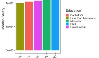
In this tutorial, we will see examples of making barplots and coloring the barplots in a few simple ways. We will see how to color barplots manually by specifying a color of interest and how to color a barplot by another variable in the dataset. Let us load tidyverse suite of … [Read more...] about Coloring Barplots with ggplot2 in R

Filed Under: barplot ggplot2, color barplots in R, R Tagged With: barplot, ggplot2, R

How to Make Horizontal Stacked Barplots with ggplot2 in R?

datavizpyr · January 2, 2020 ·

Stacked Barplots Side By Side with ggplot2 in R

Stacked barcharts are a variant of barplots, when you have data from multiple groups. In this tutorial, we will see two examples of making stacked barplots using ggplt2 in R. First we will see how to make stacked barplot of two groups with one on top of the other. In the second … [Read more...] about How to Make Horizontal Stacked Barplots with ggplot2 in R?

Filed Under: barplot ggplot2, R, stacked barplot, stacked barplot side by side Tagged With: barplot, ggplot2, R

Heatmap from Matrix using ggplot2 in R

datavizpyr · January 1, 2020 ·

Heatmap from Matrix with ggplot2

Heatmaps are data visualization tool that displays a matrix of data as a matrix of colors. For example, matrix elements with low values will have lighter colors and the elelments with high values will have a darker color. In earlier post we saw examples of making heatmap … [Read more...] about Heatmap from Matrix using ggplot2 in R

Filed Under: Heatmaps in R, Heatmaps with ggplot2, R Tagged With: ggplot2, heatmap, R

Horizontal Boxplots with Points using Seaborn in Python

datavizpyr · December 31, 2019 ·

Horizontal Boxplots with Points using Seaborn

Horizontal boxplots are useful when you have lots of groups with longer names. If you make simple boxplots, the longer names would overlap on each other and make it impossible to read the group names. Horizontal boxplots solve that problem easily. In this post, we will see an … [Read more...] about Horizontal Boxplots with Points using Seaborn in Python

Filed Under: Boxplot with points Seaborn, Python, Python Boxplot, Seaborn Tagged With: boxplot python, Horizontal boxplot Python

Sort Boxplot by Mean with Seaborn in Python

datavizpyr · December 30, 2019 ·

Sort Boxplot by Mean with Seaborn Python

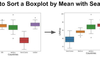
Sorting a boxplot by mean or median values of each group is more helpful, when you are making a boxplot with multiple groups. In this post we will see an example of starting with a boxplot that is unordered and we will use Pandas and Seaborn to sort the boxplot by mean (and … [Read more...] about Sort Boxplot by Mean with Seaborn in Python

Filed Under: Python, Python Boxplot, Seaborn Boxplot, Sort Boxplot by Mean Tagged With: sort boxplot python

  • « Go to Previous Page
  • Page 1
  • Interim pages omitted …
  • Page 48
  • Page 49
  • Page 50
  • Page 51
  • Page 52
  • Interim pages omitted …
  • Page 55
  • Go to Next Page »

Primary Sidebar

Python & R Viz Hubs

  • Seaborn Guide & Cookbook
  • ggplot2 Guide & Cookbook
  • Matplotlib Guide & Cookbook
  • Confusion Matrix Calculator
  • Visualizing Activation Functions
  • Visualizing Dropout
  • Visualizing Loss Functions

Buy Me a Coffee

Copyright © 2026 · Daily Dish Pro on Genesis Framework · WordPress · Log in

Go to mobile version