
In this tutorial, we will see how to make density plots with ggplot2 in R. We will start with an example of making a basic density plot with ggplot2 and see multiple examples of making the density plots better. Let us load tidyverse, a suite R packages from RStudio and also … [Read more...] about How To Make Density Plots with ggplot2 in R?
Time Series Plot or Line plot with Pandas

In this tutorial, we will learn how to make line plot or time series plot using Pandas in Python. Pandas' plotting capabilities are great for quick exploratory data visualisation. Time Series plot is a line plot with date on y-axis. Let us load the packages needed to make line … [Read more...] about Time Series Plot or Line plot with Pandas
How to Combine Multiple ggplot2 Plots? Use Patchwork
When you have made great data visualizations often you have to combine the plots into a single figure. Thomas Lin Pedersen from RStudio has made a fantastic R package to combine the plots. In his words, The goal of patchwork is to make it ridiculously simple to combine … [Read more...] about How to Combine Multiple ggplot2 Plots? Use Patchwork
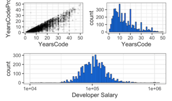
5 tips to make better histograms with ggplot2 in R

Histograms are of great use to visualize a uni-variate distribution. As ggplot2 defines, histograms "Visualise the distribution of a single continuous variable by dividing the x axis into bins and counting the number of observations in each bin." ggplot2's geom_histogram() … [Read more...] about 5 tips to make better histograms with ggplot2 in R
How to Add Outline/Edge Color to Histogram in Seaborn?

In this tutorial, we will see an example of adding edge color/edge line to histograms made with Seaborn. Let us load the packages needed to make histogram with outlines using Seaborn. We will use Seattle weather data from vega_datasets to make histograms. Let us … [Read more...] about How to Add Outline/Edge Color to Histogram in Seaborn?