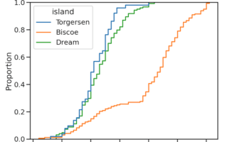
ECDF plot, aka, Empirical Cumulative Density Function plot is one of the ways to visualize one or more distributions. In this post, we will learn how to make ECDF plot using Seaborn in Python. Till recently, we have to make ECDF plot from scratch and there was no out of the … [Read more...] about How to Make ECDF plot with Seaborn in Python?
How to Make Boxplot with Jittered Data Points using Altair in Python

In this post, we will learn how to make boxplot with data points using Altair. Latest version of Altair supports making simple boxplots. However, current version of Altair does not support adding adding jittered data points on top of boxplots. Thanks to Justin Bois from Caltech, … [Read more...] about How to Make Boxplot with Jittered Data Points using Altair in Python
How to Save Multiple DataFrames to a Single Excel File in R?
Int his tutorial, we will see how to save a dataframe into an excel file in R. We will use the R package openxlsx to save dataframes as xlsx files. We will start with writing a single dataframe into an excel file with one sheet. Next, we will see how to save multiple dataframes … [Read more...] about How to Save Multiple DataFrames to a Single Excel File in R?
How To Make Scree Plot in R with ggplot2
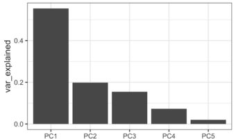
PCA aka Principal Component analysis is one of the most commonly used unsupervised learning techniques in Machine Learning. PCA on a high dimensional data can reveal the pattern or structure in the data. Scree plot is one of the diagnostic tools associated with PCA and help us … [Read more...] about How To Make Scree Plot in R with ggplot2
Rain Cloud Plots using Half Violin Plot with jittered data points in R

Raincloud plot is another interesting use of Violinplots. Rain cloud plot is basically a combination of horizontal half violin plots with jittered data points. We will see step-by-step examples of how to make raincloud plot in this tutorial in R with ggplot2. Since there is … [Read more...] about Rain Cloud Plots using Half Violin Plot with jittered data points in R