• Skip to primary navigation
  • Skip to main content
  • Skip to primary sidebar

Data Viz with Python and R

Learn to Make Plots in Python and R

  • Home
  • Seaborn
  • Matplotlib
  • ggplot2
  • Altair
  • About
    • Privacy Policy
  • Visualizing Activation Functions in Neural Networks
  • Confusion Matrix Calculator
  • Visualizing Dropout Rate in Neural Network
  • Visualizing Loss Functions in Neural Networks
  • Show Search
Hide Search

datavizpyr

Matplotlib Draw Rectangle: Add, Fill, Annotate & Highlight Regions (Step-by-Step)

datavizpyr · January 30, 2021 ·

Multiple rectangles on the same Matplotlib plot

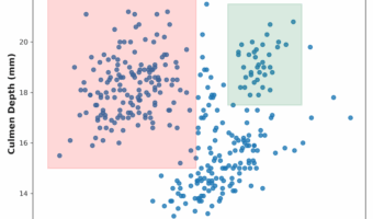
Need to highlight regions, create annotations, or add geometric shapes to your plots? This guide shows exactly how to draw rectangles in Matplotlib using patches.Rectangle—from crisp outlines to transparent overlays, labels, multiple boxes, subplots, and more. Copy-paste the code … [Read more...] about Matplotlib Draw Rectangle: Add, Fill, Annotate & Highlight Regions (Step-by-Step)

Filed Under: Matplotlib, Python Tagged With: add rectangle with matplotlib

How To Join Multiple ggplot2 Plots with cowplot?

datavizpyr · January 17, 2021 ·

Combine plots with shared legend and title using cowplot in R

Combining or joining multiple plots made with ggplot2 into a single plot is often very useful in telling a story with data. Now we have multiple options in R, including patchwork, gridExtra, and cowplot to join multiple plots made by ggplot2. In this post, we will see how to use … [Read more...] about How To Join Multiple ggplot2 Plots with cowplot?

Filed Under: Combine Multiple Plots, combine plots cowplot, ggplot2, R Tagged With: cowplot R, ggplot2, R

How To Make Dumbbell Plot in R with ggplot2?

datavizpyr · January 10, 2021 ·

Dumbbell plot with ggplot2: Customizing Colors

Dumbbell plots or connected dot plots are a great way to visualize change in something over time for multiple groups. Dumbbell plots are a great alternative to grouped barchart as dumbbell plot uses much less ink on the paper and is much simpler to understand. We can use … [Read more...] about How To Make Dumbbell Plot in R with ggplot2?

Filed Under: dumbbell plot R, ggplot2, R Tagged With: ggplot2, R

How To Make Lower Triangular Heatmap with Python?

datavizpyr · December 26, 2020 ·

Lower Triangular Heatmap with color palette in Python

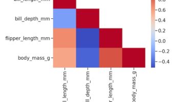
Heatmaps are a great way to quickly visualize the actual data coded as colors. Heatmaps of correlation matrix is useful to understand the relationship between multiple features or variable. However, since the correlation matrix is symmetric, it is more useful to make heatmap of … [Read more...] about How To Make Lower Triangular Heatmap with Python?

Filed Under: Heatmap Seaborn, Python Tagged With: heatmap, Lower Triangular Heatmap, Python, Seaborn

How To Color Scatterplot by a variable in Matplotlib?

datavizpyr · December 18, 2020 ·

Coloring Scatterplot with Variable using Matplotlib

Scatterplots between two numerical variables are great to see the relationship between them. Adding colors to the data points based on the third categorical variable is often useful in understanding the relationship among the three variables. In this post, we will learn how to … [Read more...] about How To Color Scatterplot by a variable in Matplotlib?

Filed Under: Color Scatterplot Matplotlib, Python, Scatterplot Matplotlib Tagged With: Matplotlib, Python

  • « Go to Previous Page
  • Page 1
  • Interim pages omitted …
  • Page 24
  • Page 25
  • Page 26
  • Page 27
  • Page 28
  • Interim pages omitted …
  • Page 55
  • Go to Next Page »

Primary Sidebar

Python & R Viz Hubs

  • Seaborn Guide & Cookbook
  • ggplot2 Guide & Cookbook
  • Matplotlib Guide & Cookbook
  • Confusion Matrix Calculator
  • Visualizing Activation Functions
  • Visualizing Dropout
  • Visualizing Loss Functions

Buy Me a Coffee

Copyright © 2026 · Daily Dish Pro on Genesis Framework · WordPress · Log in

Go to mobile version