
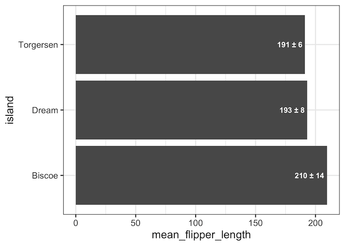
In this tutorial, we will learn how to add error values as labels on bars in a barplot. Thanks to @charliejhadley‘s nice tip showing how to add errors on barplot labels using str_glue() function. The main idea behind adding errors to labels is very similar to adding barplot heights as labels. In addition to the… Continue reading How to Add Error Values to Barplot Labels in R with ggplot2
Author: datavizpyr
Bump Plot with ggbump

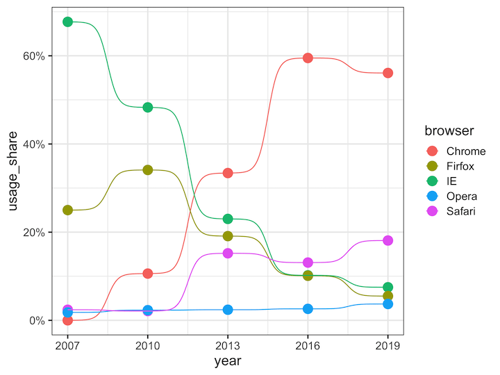
Bump plots are line plots with dots showing the data points. Bump plots can be useful in understanding the change in rank over time. In this tutorial, we will learn how to make bump plots using ggbump package, a ggplot2 extension package. To make a bump plot we will use the top browser usage over… Continue reading Bump Plot with ggbump
How to wrap long axis tick labels into multiple lines in ggplot2


Dealing with long, overlapping axis labels that make your ggplot2 visualizations unreadable? This comprehensive guide shows you exactly how to wrap axis labels ggplot2 into multiple lines with ready-to-use code examples. Long axis labels are a common problem in data visualization, especially when working with categorical data, survey responses, or detailed variable names. When axis… Continue reading How to wrap long axis tick labels into multiple lines in ggplot2
How to Remove Space between Legend at Bottom and x-axis in ggplot2


Goal: This tutorial shows how to control the spacing around the ggplot2 legend—especially when the legend is placed at the bottom—and how to fine-tune multi-row legends. We begin with a reproducible baseline that illustrates the problem, then move through five practical fixes. You’ll learn when to use each parameter (x = NULL, legend.margin, plot.margin, multi-row… Continue reading How to Remove Space between Legend at Bottom and x-axis in ggplot2
How to add percentage label on bars in barplot with ggplot2


Adding percentage labels or count labels to bars in a barplot can help read the barplot quickly. In this tutorial, we will learn how to add labels with percentage symbol on bars in a barplot made with ggplot2 in R. Loading Packages and Dataset Let us get started by loading packages needed and a dataset… Continue reading How to add percentage label on bars in barplot with ggplot2