Last updated on August 14, 2025
In this post, we will learn how to properly annotate a bars barplot, where there are both positive and negative values/bars in ggplot2. In ggplot2, we can use gem_text() with label option to annotate text or bar heights on a barplot easily. However, when we have a barplot that has both positive and negative bars, We would live to annotate text/values such that it perfectly aligns with the bar heights. The simple attempt to annotate using geom_text() will not result in correctly aligned values.
library(tidyverse)
library(palmerpenguin)
library(broom)
theme_set(theme_bw(16)
set.seed(1234)
df <- tibble(grp = LETTERS[1:10],
             value = rnorm(n=10, mean=20, sd=40))|>
  mutate(direction=ifelse(value>0, "up", "down"))
df

# A tibble: 10 × 3
   grp    value direction
   <chr>  <dbl> <chr>
 1 A     -28.3  down
 2 B      31.1  up
 3 C      63.4  up
 4 D     -73.8  down
 5 E      37.2  up
 6 F      40.2  up
 7 G      -2.99 down
 8 H      -1.87 down
 9 I      -2.58 down
10 J     -15.6  down
How to annotate barplots with both positive and negative bars
df |>
  ggplot(aes(x=grp, y=value, fill=direction))+
  geom_col()+
  theme(legend.position="none")
ggsave("barplot_with_both_negative_n_positive_bars.png")

Annotating barplots with both positive and negative bars using geom_text()
df |>
  ggplot(aes(x=grp, y=value, fill=direction))+
  geom_col()+
  theme(legend.position="none")+
  geom_text(aes(label=round(value)))
ggsave("annotate_barplot_with_geom_text.png")
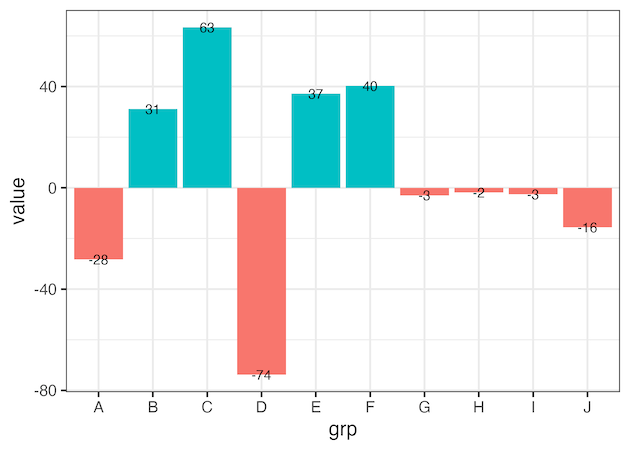
Adjusting annotation location on barplot using geom_text()’s nudge_x or nudge_y is hard
df |>
  ggplot(aes(x=grp, y=value, fill=direction))+
  geom_col()+
  theme(legend.position="none")+
  geom_text(aes(label=round(value)), nudge_y=5)
ggsave("annotate_barplot_with_geom_text_with_nudge_to_align.png")
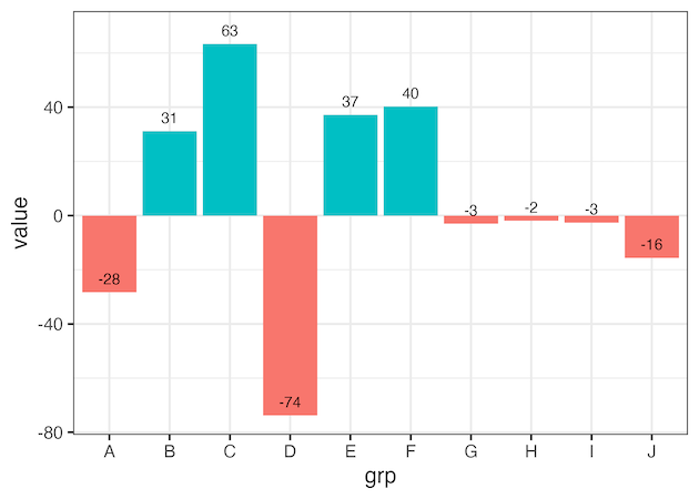
Correctly align annotation on barplot with both negative and positive values on bars
df |>
  ggplot(aes(x=grp, y=value, fill=direction))+
  geom_col()+
  theme(legend.position="none")+
  geom_text(aes(y= value + 5*sign(value) ,
            label=round(value)))
ggsave("annotate_barplot_with_both_negative_n_positive_values_on_bars_aligned.png")

Correctly align annotation on a horizontal barplot with both negative and positive values
df |>
  ggplot(aes(y = grp, x=value, fill=direction))+
  geom_col()+
  theme(legend.position="none")+
  geom_text(aes(x = value + 5*sign(value),
                label=round(value)))
ggsave("annotate_horizontal_barplot_with_both_negative_n_positive_values_on_bars_aligned.png")

Explore the Complete ggplot2 Guide
35+ tutorials with code: scatterplots, boxplots, themes, annotations, facets, and more—tested and beginner-friendly.
Visit the ggplot2 Hub → No fluff—just code and visuals.