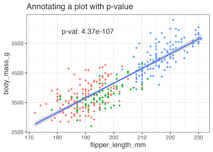
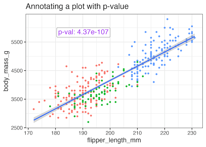
In this tutorial, we will learn how to add statistical significance to a plot made with ggplot2. Let us we have scatterplot to help understand the relation between two numerical variables and we have done linear regression analysis to find the statisitical significance of the association.
Here we will show with example how to annotate the scatter plot with p-value showing the statistical significance of the association with two examples. We will use geom_text() function in combination with packages glue and ggtext.
library(tidyverse)
library(palmerpenguins)
library(ggtext)
library(glue)
theme_set(theme_bw(16))
We will use Palmer penguin dataset to make the scatter plot.
penguins |> head()

# A tibble: 6 × 8
  species island    bill_length_mm bill_depth_mm flipper_length_mm body_mass_g
  <fct>   <fct>              <dbl>         <dbl>             <int>       <int>
1 Adelie  Torgersen           39.1          18.7               181        3750
2 Adelie  Torgersen           39.5          17.4               186        3800
3 Adelie  Torgersen           40.3          18                 195        3250
4 Adelie  Torgersen           NA            NA                  NA          NA
5 Adelie  Torgersen           36.7          19.3               193        3450
6 Adelie  Torgersen           39.3          20.6               190        3650
# ℹ 2 more variables: sex <fct>, year <int>
How to Add P-value to a plot in ggplot2
Here is a scatter plot between two numerical variables from penguins dataset.
p1 <- penguins |>
  ggplot(aes(flipper_length_mm, body_mass_g))+
  geom_point(aes(color=species))+
  geom_smooth(method = "lm", formula = y ~ x) +
  theme(legend.position = "none")+
  labs(title="How to annotate the plot with p-value")

p1
ggsave("how_to_annotate_with_p_value_ggplot2.png")

In order to annotate the plot with p-value, let us first perform the statistical test using linear regression model and save p-value in a dataframe. In addition to the p-value, we also create variables to help annotate the plot with the p-value.
Do statistical test and save result in dataframe
In the code below, we use tidyverse framework to perform linear regression and store the results in a dataframe.
pval_df <- penguins |>
  summarize(lm_mod = list(lm(flipper_length_mm~ body_mass_g)),
            lm_res = map(lm_mod, broom::tidy)) |>
  unnest(lm_res) |>
  filter(term=="body_mass_g") |>
  select(p.value) |>
  mutate(flipper_length_mm=200,
         body_mass_g=6000,
         label=glue("p-val: {signif(p.value,3)}"))
This is how the dataframe with p-value looks like this.
pval_df
# A tibble: 1 × 4
    p.value flipper_length_mm body_mass_g label
      <dbl>             <dbl>       <dbl> <glue>
1 4.37e-107               200        6000 p-val: 4.37e-107
Adding statistical significance as annotation with geom_text()
Now we can use geom_text() function available in ggplot2 to add the p-value as annotation to the plot.
p1 +
  geom_text(
    data = pval_df,
    aes(label = label),
    hjust = 1, vjust = 1,
    size=6
  )+
  labs(title="Annotating a plot with p-value")
ggsave("annotate_plot_with_p_value_ggplot2.png")

Annotating a plot with p-value using ggtext’s geom_richtext()
We can further customize the annotation using geom_richtext() function from ggtext package to add color and a box around the annotation text.
p1+
   geom_richtext(
    data = pval_df,
    aes(
      label = label#,
      #fill = after_scale(alpha(colour, .2))
    ),
    text.colour = "purple",
    hjust = 1, vjust = 1,
    size=6
  )+
  labs(title="Annotating a plot with p-value")
ggsave("annotate_plot_with_p_value_ggplot2_example2.png")


