In this tutorial, we will learn how to add text annotations to all data points in a scatterplot made with Python. One of the easier ways to add text annotations to points in a scatter plot is to use Seaborn in Python. Seaborn Objects, a newer Seaborn API with grammar of graphics like ggplot2 offers an intuitive approach to add the text annotations.
Let us first load the packages needed.
import seaborn as sns
import seaborn.objects as so
import pandas as pd
We will use Palmer penguin dataset from Seaborn built-in datasets.
# Load Palmer Penguin dataset
penguins = sns.load_dataset("penguins")
To make scatter plot, we will randomly sample 25 rows using Pandas sample() function on the penguins dataset.
df = penguins.sample(25)
df.head()

	species	island	bill_length_mm	bill_depth_mm	flipper_length_mm	body_mass_g	sex
282	Gentoo	Biscoe	45.7	13.9	214.0	4400.0	Female
339	Gentoo	Biscoe	NaN	NaN	NaN	NaN	NaN
78	Adelie	Torgersen	36.2	16.1	187.0	3550.0	Female
206	Chinstrap	Dream	42.5	17.3	187.0	3350.0	Female
21	Adelie	Biscoe	37.7	18.7	180.0	3600.0	Male
Scatter plot with Seaborn Objects
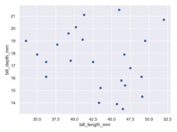
Let us go ahead and make a scatter plot with Seaborn objects. With Seaborn objects API, we add each aspect of the plot as a layer. For example first we specify the plotting object by specifying the variables we are plotting. And then add a layer for scatterplot plot with Dot() function. And then go ahead to save the plot as png file with save() function as another layer.
(
    so.Plot(df, x="bill_length_mm",
            y="bill_depth_mm")
    .add(so.Dot())
    .save("scatterplot_Seaborn_objects.png",
           format='png',
           dpi=150)
)
Adding Text Annotation to all data points
With Seaborn objects API, we can add text annotations to all data points by specifying the column name that contains the text that we we would like to annotate data points with. We use “text” argument to specify the column name to the Plot() function. And then we add the annotation layer using Text() function.
(
    so.Plot(df, x="bill_length_mm", y="bill_depth_mm",
            color="species",
            text="species")
        .add(so.Dot())
        .add(so.Text())
        .label(title="Annotating Data points", x="Bill Length", y="Bill Depth")
        .layout(size=(8, 6))
        .save("add_text_annotations_to_datapoints_scatterplot_Python.png",
           format='png',
           dpi=150)
)
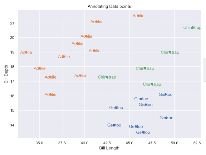
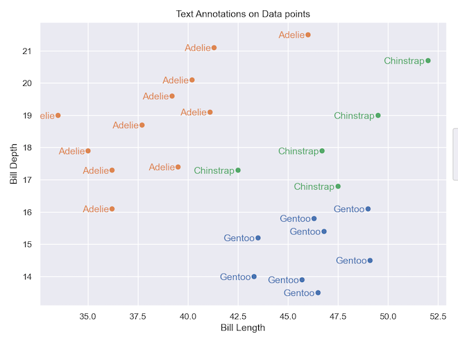
In the above scatter plot, the data points and the text annotation overlaps. We can customize the alignment of the text annotation to either left or right side of the data points. Here we horizontally align to right using halign=”right” argument.
(
    so.Plot(df, x="bill_length_mm", y="bill_depth_mm",
            color="species",
            text="species")
        .add(so.Dot())
        .add(so.Text(halign="right"))
        .label(title="Text Annotations on Data points", x="Bill Length", y="Bill Depth")
        .layout(size=(8, 6))
        .save("add_text_annotations_to_datapoints_scatterplot_Seaborn_objects.png",
           format='png',
           dpi=150)
)