Adding percentage labels or count labels to bars in a barplot can help read the barplot quickly. In this tutorial, we will learn how to add labels with percentage symbol on bars in a barplot made with ggplot2 in R.
Loading Packages and Dataset
Let us get started by loading packages needed and a dataset to make the barplots with percentage values on bars.
library(tidyverse)
We will use student debt dataset showing racial disparity from tidytuesday project.
student_debt <- read_csv("https://raw.githubusercontent.com/rfordatascience/tidytuesday/master/data/2021/2021-02-09/student_debt.csv")
Our data looks like this.
student_debt %>% head()
## # A tibble: 6 × 4
##    year race     loan_debt loan_debt_pct
##   <dbl> <chr>        <dbl>         <dbl>
## 1  2016 White       11108.         0.337
## 2  2016 Black       14225.         0.418
## 3  2016 Hispanic     7494.         0.219
## 4  2013 White        8364.         0.285
## 5  2013 Black       10303.         0.412
## 6  2013 Hispanic     3177.         0.157
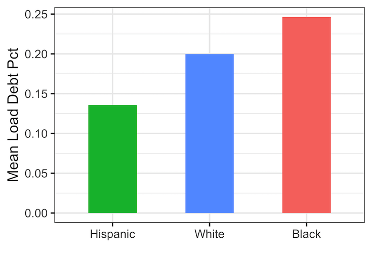
Simple Barplot with Percentage values as bar heights
Let us make a simple barplot showing the average loan debt percentage for each race in the dataset.
p1 <- student_debt %>%
  group_by(race) %>%
  summarize(average_loan_debt_pct=mean(loan_debt_pct)) %>%
  ggplot(aes(x = forcats::fct_reorder(race, average_loan_debt_pct),
             y = average_loan_debt_pct,
             fill=race))+
  geom_col(width=0.5)+
  theme(legend.position="none")+
  labs(x="",
       y="Mean Load Debt Pct")
print(p1)
ggsave("simple_barplot_with_ggplot2_with_percent_values_on_y_axis.png")
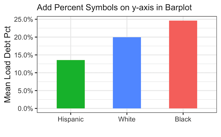
Adding Percentage Symbol on y-axis
Note that our y-axis values or bar heights are in percentage. A better way to make the barplot is to add the percentage symbol on the y-axis instead of the fraction we have now.
We can use scales package’ percent method to add percentage symbol to the y-axis using scale_y_continuous() function.
p1 +
  scale_y_continuous(labels = scales::percent,
                     breaks = scales::pretty_breaks(n = 8))
ggsave("barplot_with_percent_symbol_on_y_axis.png")
Now our y-axis text has percentage symbols in the barplot.
Add Percentage Labels on bars in barplot using label and geom_text()
We can improve the barplot further by labeling the percentage values directly on the bars with percent symbols. To do that, we will use label argument with scales’ percent function. And use geom_text() function to add the labels with percentage symbol on bars.
student_debt %>%
  group_by(race) %>%
  summarize(average_loan_debt_pct=mean(loan_debt_pct)) %>%
  ggplot(aes(x = forcats::fct_reorder(race, average_loan_debt_pct),
             y = average_loan_debt_pct,
             fill=race,
             label=scales::percent(average_loan_debt_pct)))+
  geom_col(width=0.5)+
  theme(legend.position="none")+
  labs(x="",
       y="Mean Load Debt")+
  scale_y_continuous(labels = scales::percent,
                     breaks = scales::pretty_breaks(n = 8))+
  geom_text(nudge_y= -.01,
            color="white",
            size = 5,
            fontface="bold")
gsave("add_label_with_percent_symbol_to_barplot_ggplot2.png")