Last updated on August 14, 2025
Adding statistical significance indicators to your data visualizations is crucial for communicating research findings effectively. When working with ggplot2 in R, displaying p-values directly on scatter plots helps viewers immediately understand the statistical relationship between variables.
In this comprehensive tutorial, you’ll learn how to annotate ggplot2 plots with p-values from linear regression analysis. We’ll cover two powerful methods: using the standard geom_text() function and the enhanced geom_richtext() from the ggtext package for customized annotations
Required R packages: tidyverse, palmerpenguins, ggtext, glue, and broom for statistical modeling.
What You’ll Learn
- How to add p-values to ggplot2 scatter plots
- Performing linear regression analysis and extracting statistical results
- Using geom_text() for basic p-value annotations
- Customizing p-value displays with geom_richtext() and styling options
- Best practices for statistical significance visualization in R
library(tidyverse)
library(palmerpenguins)
library(ggtext)
library(glue)
theme_set(theme_bw(16))
We will use Palmer penguin dataset to make the scatter plot.
penguins |> head()

# A tibble: 6 × 8
  species island    bill_length_mm bill_depth_mm flipper_length_mm body_mass_g
  <fct>   <fct>              <dbl>         <dbl>             <int>       <int>
1 Adelie  Torgersen           39.1          18.7               181        3750
2 Adelie  Torgersen           39.5          17.4               186        3800
3 Adelie  Torgersen           40.3          18                 195        3250
4 Adelie  Torgersen           NA            NA                  NA          NA
5 Adelie  Torgersen           36.7          19.3               193        3450
6 Adelie  Torgersen           39.3          20.6               190        3650
# ℹ 2 more variables: sex <fct>, year <int>
How to Add P-value to a plot in ggplot2
Here is a scatter plot between two numerical variables from penguins dataset.
p1 <- penguins |>
  ggplot(aes(flipper_length_mm, body_mass_g))+
  geom_point(aes(color=species))+
  geom_smooth(method = "lm", formula = y ~ x) +
  theme(legend.position = "none")+
  labs(title="How to annotate the plot with p-value")

p1
ggsave("how_to_annotate_with_p_value_ggplot2.png")

In order to annotate the plot with p-value, let us first perform the statistical test using linear regression model and save p-value in a dataframe. In addition to the p-value, we also create variables to help annotate the plot with the p-value.
Do statistical test and save result in dataframe
In the code below, we use tidyverse framework to perform linear regression and store the results in a dataframe.
pval_df <- penguins |>
  summarize(lm_mod = list(lm(flipper_length_mm~ body_mass_g)),
            lm_res = map(lm_mod, broom::tidy)) |>
  unnest(lm_res) |>
  filter(term=="body_mass_g") |>
  select(p.value) |>
  mutate(flipper_length_mm=200,
         body_mass_g=6000,
         label=glue("p-val: {signif(p.value,3)}"))
This is how the dataframe with p-value looks like this.
pval_df
# A tibble: 1 × 4
    p.value flipper_length_mm body_mass_g label
      <dbl>             <dbl>       <dbl> <glue>
1 4.37e-107               200        6000 p-val: 4.37e-107
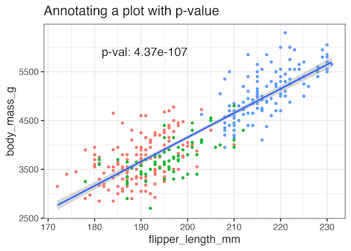
Adding statistical significance as annotation with geom_text()
Now we can use geom_text() function available in ggplot2 to add the p-value as annotation to the plot.
p1 +
  geom_text(
    data = pval_df,
    aes(label = label),
    hjust = 1, vjust = 1,
    size=6
  )+
  labs(title="Annotating a plot with p-value")
ggsave("annotate_plot_with_p_value_ggplot2.png")
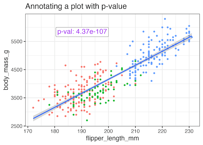
Annotating a plot with p-value using ggtext’s geom_richtext()
We can further customize the annotation using geom_richtext() function from ggtext package to add color and a box around the annotation text.
p1+
   geom_richtext(
    data = pval_df,
    aes(
      label = label#,
      #fill = after_scale(alpha(colour, .2))
    ),
    text.colour = "purple",
    hjust = 1, vjust = 1,
    size=6
  )+
  labs(title="Annotating a plot with p-value")
ggsave("annotate_plot_with_p_value_ggplot2_example2.png")
Explore the Complete ggplot2 Guide
35+ tutorials with code: scatterplots, boxplots, themes, annotations, facets, and more—tested and beginner-friendly.
Visit the ggplot2 Hub → No fluff—just code and visuals.