Last updated on January 20, 2022
In this tutorial, we will learn how to add caption to a plot made with ggplot2 in R. Caption in R is a small text at the right corner of a plot that adds some value to the plot.
We will use faithful eruption data available from built-in dataset in R.
library(tidyverse)
faithful %>%
  head()

##   eruptions waiting
## 1     3.600      79
## 2     1.800      54
## 3     3.333      74
## 4     2.283      62
## 5     4.533      85
## 6     2.883      55
Simple plot with ggplot2
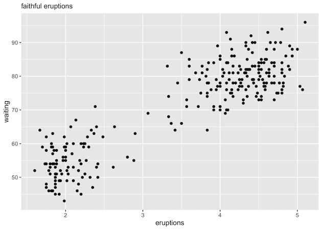
First, let us make a scatter plot with the default ggplot2 theme. Note we have used labs() function to add a subtitle to the plot.
faithful %>%
  ggplot(aes(x=eruptions, waiting))+
  geom_point()+
  labs(subtitle="faithful eruptions")
ggsave("ggplot_scatterplot.png")
Adding caption to a plot with labs() function in ggplot2
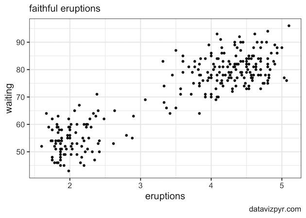
We can add a caption to a ggplot using caption argument to labs() function. Now labs() function also has caption in addition to the subtitle.
faithful %>%
  ggplot(aes(x=eruptions, waiting))+
  geom_point()+
  labs(subtitle="faithful eruptions",
       caption="datavizpyr.com"
       )
ggsave("add_captions_to_ggplot.png")
Notice the small text saying datavizpyr.com at the right corner of the plot.

Customize caption text size
Let us customize the caption to make it better. We can increase the text size of the caption in a few ways. One way to increase the caption text size is to use the ggplot2 theme with base text size. This would customize all text sizes of the plot.
faithful %>%
  ggplot(aes(x=eruptions, waiting))+
  geom_point()+
  labs(subtitle="faithful eruptions",
       caption="datavizpyr.com"
       )+
  theme_bw(16)
ggsave("increase_caption_size_ggplot.png")
In this example, we have used black and white theme with theme_bw() with bases text size 16. We can see that now the caption text size is bigger than the default size.
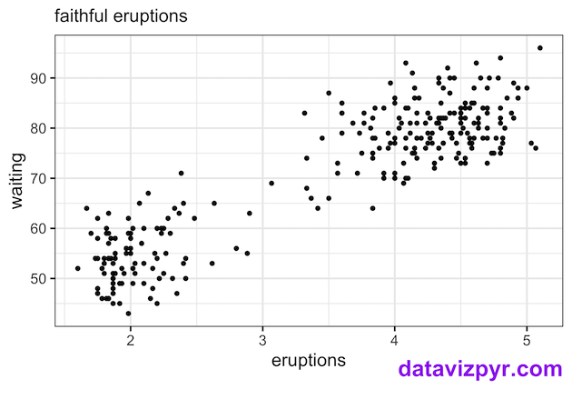
Customize the look of caption using element_text() in theme()
Another way to specifically customize the caption text and its looks is to use theme() function. Here, we use theme element element_text() function to customize the looks of the caption.
We use plot.caption argument to set the font size, color and its location as shown below.
faithful %>%
  ggplot(aes(x=eruptions, waiting))+
  geom_point()+
  labs(subtitle="faithful eruptions",
       caption="datavizpyr.com"
       )+
  theme_bw(16)+
  theme(plot.caption= element_text(size=20,
                                   color="purple",
                                   face="bold",
                                   vjust = 5))
ggsave("customize_caption_with_theme_element_text_ggplot.png")
Note that our caption is much bigger and in purple color. In addition we have move the caption closer the x-axis.
Explore the Complete ggplot2 Guide
35+ tutorials with code: scatterplots, boxplots, themes, annotations, facets, and more—tested and beginner-friendly.
Visit the ggplot2 Hub → No fluff—just code and visuals.