Last updated on August 14, 2025
Need to save space or create more polished visualizations? This comprehensive guide shows you exactly how to place ggplot2 legend inside plot using multiple positioning methods, with ready-to-use code examples that work for any chart type.
Default legend placement outside the plot area can waste valuable space, especially in publications, dashboards, or presentations where every inch matters. Moving the legend inside your plot creates cleaner, more compact visualizations while maintaining all the essential information your audience needs.
In this tutorial, you’ll master legend position ggplot2 techniques using theme(), coordinate-based positioning, and advanced customization options. Whether you’re creating scatter plots, bar charts, or complex multi-layered visualizations, these methods will give you complete control over legend placement. We will use ggplot2’s theme() function and legend.position argument to put the legend inside the plot.
Let us load tidyverse and load gapminder data for making a scatter plot with legend.
library(tidyverse)
How to Move Legend to inside plot in ggplot2?
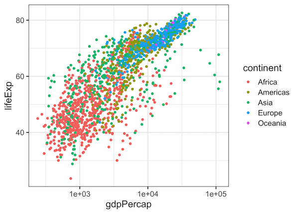
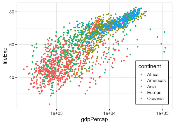
We can move the ggplot2 legend inside the plot, when there is empty space inside. We can specify the location of legend using ggplot2 function theme(). Here we specify legend.position = c(0.87,0.25) to place the legend inside. The tuple basically specifies the x and y position in terms of the plot size in unit scale.
gapminder %>%
  ggplot(aes(gdpPercap,lifeExp, color=continent)) +
  geom_point() +
  scale_x_log10()+
  theme(legend.position = c(0.87, 0.25))
How to Move Legend to inside plot and Customize Legend Background in ggplot2?
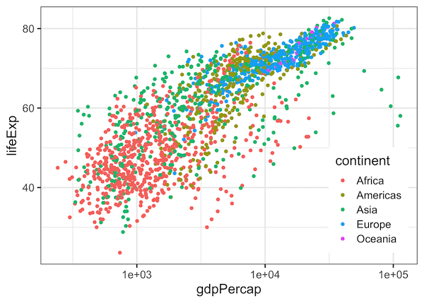
In addition to placing the legend inside, we can also customize the legend box using legend.background argument inside theme() function. Here we make the legend box filled with white color and black color outline.
gapminder %>%
  ggplot(aes(gdpPercap,lifeExp, color=continent)) +
  geom_point() +
  scale_x_log10()+
  theme(legend.position = c(0.87, 0.25),
        legend.background = element_rect(fill = "white", color = "black"))
Explore the Complete ggplot2 Guide
35+ tutorials with code: scatterplots, boxplots, themes, annotations, facets, and more—tested and beginner-friendly.
Visit the ggplot2 Hub → No fluff—just code and visuals.