Sometimes when you make a plot in R you might want the plot without ticks and text on axis. In this tutorial, we will learn how to remove x-axis or y-axis ticks and the text in R with ggplot2.
Let us first load tidyverse, a suite of R packages from RStudio. Let us also load gapminder R package as we will be using gapminder data to make the plot with x-axis ticks and text.
1 2 3 | library(tidyverse)library(gapminder)theme_set(theme_bw(base_size=16)) |
We will use a subset of gapminder data containing countries from Africa. Let us make the year variable as factor.
1 2 3 | df1 <- gapminder %>% filter(continent %in% c("Africa")) %>% mutate(year=factor(year)) |
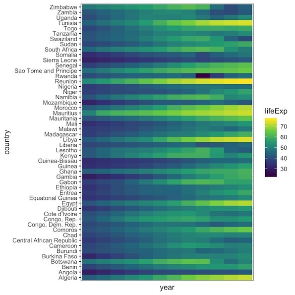
Our example plot in this post is a heatmap of lifeExp over years for african countries. We can make heatmap from tidy data using ggplot2’s geom_tile() function. We have country on y-axis and year on x-axis and the values of heatmap are lifeExp.
1 2 3 4 | df1 %>% ggplot(aes(y=country, x=year, fill=lifeExp)) + geom_tile() + scale_fill_viridis_c() |
Note that the simple heatmap we made has both x-axis and y-axis ticks and text. x and y-axis ticks are the tiny black lines. And the x-axis texts for its ticks is the year values on x-axis.
Remove Axes Text/Tick in ggplot2
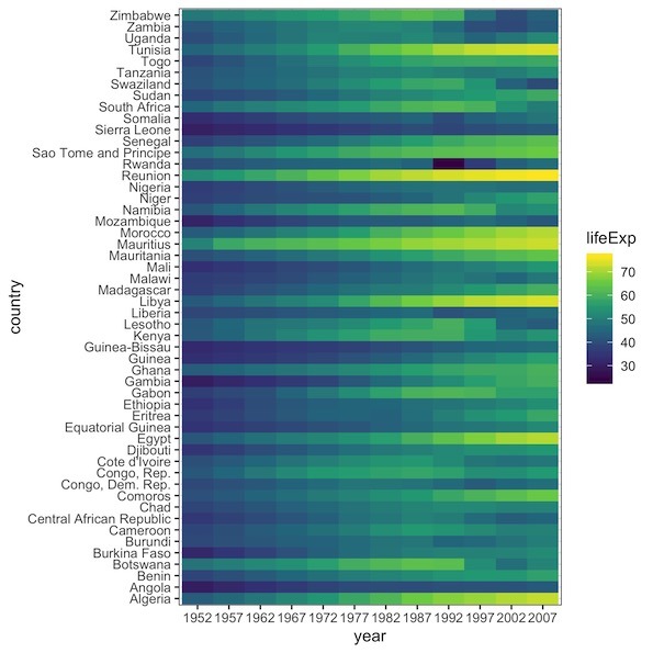
We can remove axis ticks and texts using the theme function in ggplot2. The theme() function in ggplot2 is a powerful function that allows users to customize various aspects of ggplot2 theme including the axis ticks and texts.
To remove x-axis ticks we specify the argument axis.ticks.x = element_blank() inside the theme(). And similarly to remove x-axis text, we specify axis.text.x = element_blank().
1 2 3 4 5 6 | df1 %>% ggplot(aes(y=country, x=year, fill=lifeExp)) + geom_tile() + scale_fill_viridis_c() + theme(axis.ticks.x = element_blank(), axis.text.x = element_blank()) |
Now we have the heatmap with no x-axis ticks and texts. We can also easily remove y-axis ticks and texts using axis.ticks.y and axis.text.y arguments.