In this post, we will learn how to make a scatterplot with marginal histograms in R. We will use ggExtra, one of the ggplot2 extension packages to make scatterplot with marginal histogram. First, we will add simple marginal histograms to a scatterplot made with ggplot2. Next, we we will show how to color the histogram by a variable in the data to make a overlapping marginal histograms colored by the variable.
Let us load the packages first. We need to have ggExtra installed and load it.
library(tidyverse)
library(ggExtra)
theme_set(theme_bw(16))
We will use Palmer penguins dataset to make the plots. Here, we load the data directly from datavizpyr.com‘s github page.
penguins <- readr::read_tsv("https://raw.githubusercontent.com/datavizpyr/data/master/palmer_penguin_species.tsv")
##
## ── Column specification ────────────────────────────────────────────────────────
## cols(
##   species = col_character(),
##   island = col_character(),
##   culmen_length_mm = col_double(),
##   culmen_depth_mm = col_double(),
##   flipper_length_mm = col_double(),
##   body_mass_g = col_double(),
##   sex = col_character()
## )
To make marginal histograms we will use ggExtra R package. This is a ggplot2 extension package that nicely workings with plots made with ggplot2. To start with, let us make a scatter plot using ggplot2 in R.
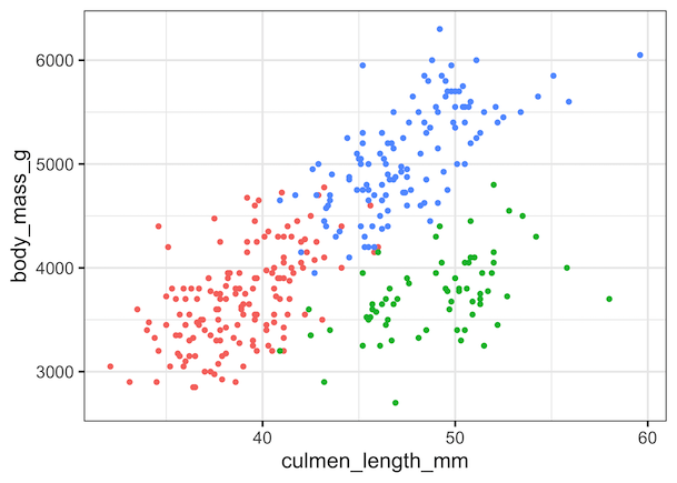
p1 <- penguins %>%
  ggplot(aes(x=culmen_length_mm, body_mass_g, color=species))+
  geom_point() +
  theme(legend.position="none")
print(p1)
Marginal Histograms with ggExtra’s ggMarginal()
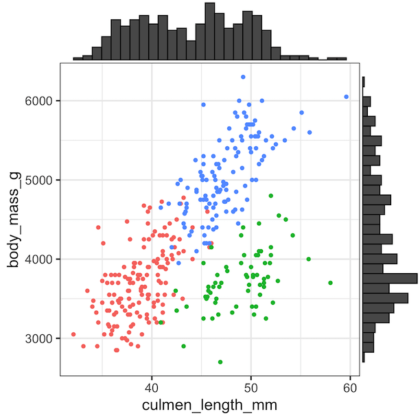
We can add the marginal histograms on top of the scatter plot object using ggExtra’s function ggMarginal(). With ggExtra package we can add multiple types of plots as marginal. Therefore, we also need to specify that we are interested in marginal histograms with type=”histogram”.
ggMarginal(p1, type="histogram")
We have a nice scatter plot with marginal histograms in grey color.
Coloring Marginal Histograms with ggExtra’s ggMarginal()
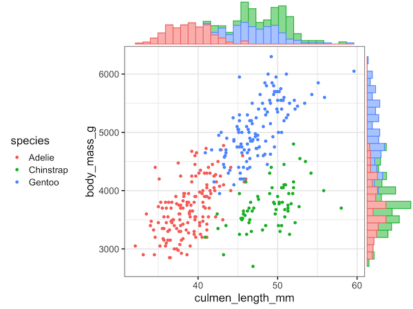
Using ggExtra, we can also color the marginal histograms by a third variable. We need to specify groupColour=TRUE to color the histogram by grouping variable specified in the scatter plot.
ggMarginal(p1, type="histogram", groupColour = TRUE, groupFill = TRUE)
Note that we have made the scatter plot marginal histograms colored by a third variable without the legends for the color. The best way to add legend is to place the legend on the left size (or top or bottom) instead of the default “right” side. As legend on right side will be in between the marginal and the scatter plot.
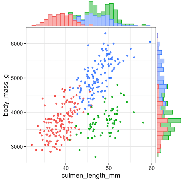
p1 <- penguins %>%
  ggplot(aes(x=culmen_length_mm, body_mass_g, color=species))+
  geom_point() +
  theme(legend.position="left")
ggMarginal(p1, type="histogram", groupColour = TRUE, groupFill = TRUE)