In this tutorial, we will learn how to visualize a company’s stock return over time. A stock’s return is defined as the capital gains/losses and income from dividend. We will use the adjusted stock price to compute the nominal return using the fantastic tidyquant R package.
First, we will download the stock data of a company, in this example we use Microsoft’s stock prices using the ticker name. Then will compute monthly and yearly return of the stock. Next, we will see how to make simple visualization of the return over time using barplot and show step by step how to customize and improve the stock retrun barplots.
Downloading Stock Price Data
Let us get started loading the packages needed.
library(tidyquant)
library(tidyverse)
theme_set(theme_bw(16))
We can use tq_get() function from tidyquant package to get the stock prices of a company between two dates of interest. Here we download Microsoft’s stock prices from year 2010.
company <- "MSFT"

microsoft_stock <- tq_get(company,
                          get = "stock.prices",
                          from = "2010-01-01",
                          to = Sys.Date())
And our downloaded stock data looks like this. For each date we have opening stock price, highest and lowest prices in the day, closing price, volume of trades made that day.
microsoft_stock %>%
   head()

## # A tibble: 6 × 8
##   symbol date        open  high   low close   volume adjusted
##   <chr>  <date>     <dbl> <dbl> <dbl> <dbl>    <dbl>    <dbl>
## 1 MSFT   2010-01-04  30.6  31.1  30.6  31.0 38409100     23.9
## 2 MSFT   2010-01-05  30.8  31.1  30.6  31.0 49749600     23.9
## 3 MSFT   2010-01-06  30.9  31.1  30.5  30.8 58182400     23.8
## 4 MSFT   2010-01-07  30.6  30.7  30.2  30.5 50559700     23.5
## 5 MSFT   2010-01-08  30.3  30.9  30.2  30.7 51197400     23.7
## 6 MSFT   2010-01-11  30.7  30.8  30.1  30.3 68754700     23.4
Computing Monthly Returns of a Stock
One of the ways to compute daily/monthly/quarterly/monthly return of a stock using tidyquant package is to sue the tq_transmute() function.
MSFT_monthly_returns <- microsoft_stock %>%
    tq_transmute(select     = adjusted,
                 mutate_fun = periodReturn,
                 period     = "monthly",
                 type       = "arithmetic")
tq_transmute() gives us date and return tibble.
MSFT_monthly_returns %>%
  head()
## # A tibble: 6 × 2
##   date       monthly.returns
##   <date>               <dbl>
## 1 2010-01-29         -0.0895
## 2 2010-02-26          0.0221
## 3 2010-03-31          0.0216
## 4 2010-04-30          0.0427
## 5 2010-05-28         -0.151
## 6 2010-06-30         -0.108
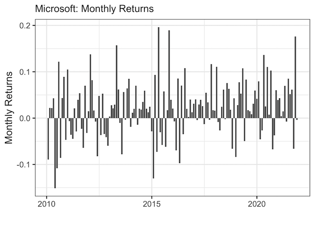
Visualizing monthly stock return with barplot
Let us visualize monthly returns with date on x-axis and monthly return on y-axis as a barplot.
MSFT_monthly_returns %>%
  ggplot(aes(x = date, y = monthly.returns)) +
    geom_col() +
    labs(subtitle = "Microsoft: Monthly Returns",
         y = "Monthly Returns", x = "")
ggsave("stock_monthly_return_barplot.png")
We can see that mostly the returns are positive.
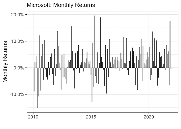
Monthly returns are represented as percentages and it will be better to add percent symbol to make it easy to read.
To add percent symbol, we will use scales package labels with scale_y_continous() function.
MSFT_monthly_returns %>%
  ggplot(aes(x = date, y = monthly.returns)) +
    geom_col() +
    scale_y_continuous(labels = scales::percent) +
    labs(subtitle = "Microsoft: Monthly Returns",
         y = "Monthly Returns", x = "")
ggsave("monthly_return_barplot_percent_symbol_scales.png")
Now we have percent symbols for the return. Note that scales package expect fractional values to convert as percent.
Let us customize further by adding colors to differentiate the gain and loss with specific colors. And then flip the x and y coordinates using coord_flip().
MSFT_monthly_returns %>%
  mutate(return= ifelse(monthly.returns > 0, "+ve", "-ve")) %>%
  ggplot(aes(x = date, y = monthly.returns, fill=return)) +
  geom_col() +
  scale_y_continuous(labels = scales::percent) +
  geom_hline(yintercept = 0) +
  labs(subtitle = "Microsoft: Monthly Returns",
         x = "Monthly Returns", y = "") +
  theme(axis.ticks = element_blank(),
        legend.position="bottom")+
  scale_fill_manual( values = c("-ve"="red", "+ve"="darkgreen" ))+
  coord_flip()
ggsave("monthly_return_barplot_customized_single_stock.png")

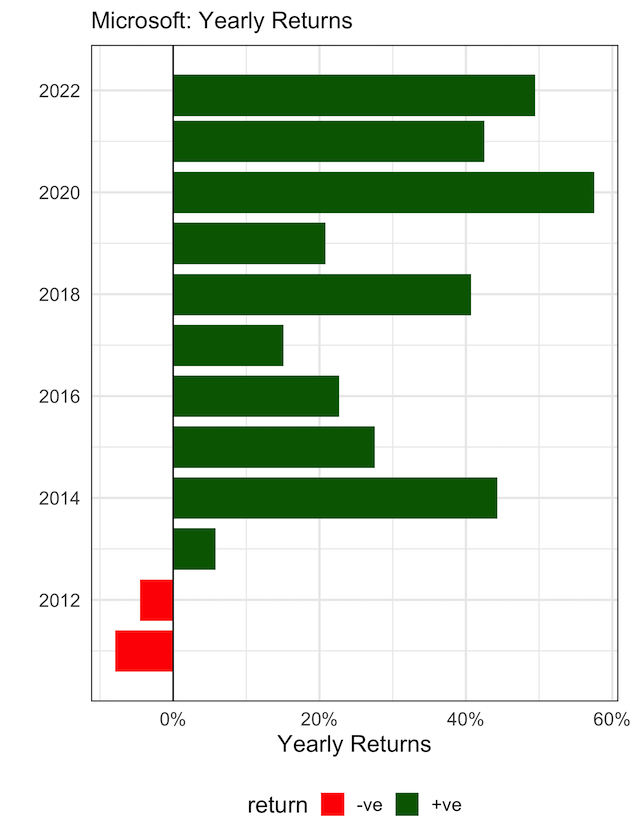
Visualizing yearly return with barplots
Monthly returns of a stock offer rich information. We can use tq_transmute() function again to get yearly returns. Yearly nominal returns can be of more help to understand the company’s stock behaviour.
MSFT_yearly_returns <- microsoft_stock %>%
    tq_transmute(select     = adjusted,
                 mutate_fun = periodReturn,
                 period     = "yearly",
                 type       = "arithmetic")
Let us use the same barplot idea that we used for monthly returns.
MSFT_yearly_returns %>%
  mutate(return= ifelse(yearly.returns > 0, "+ve", "-ve")) %>%
  ggplot(aes(x = date, y = yearly.returns, fill=return)) +
  geom_col() +
  geom_hline(yintercept = 0) +
  scale_y_continuous(labels = scales::percent) +
    labs(subtitle = "Microsoft: Yearly Returns",
         y = "Yearly Returns", x = "") +
  theme(axis.ticks = element_blank(),
        legend.position = "bottom")+
  scale_fill_manual( values = c("-ve"="red", "+ve"="darkgreen" ))+
  coord_flip()
ggsave("yearly_return_barplot_single_stock_ggplot2.png")