• Skip to primary navigation
  • Skip to main content
  • Skip to primary sidebar

Data Viz with Python and R

Learn to Make Plots in Python and R

  • Home
  • Python Viz
  • Seaborn
  • Altair
  • R Viz
  • ggplot2
  • About
    • Privacy Policy
  • Show Search
Hide Search

Visualizing Stock Price of Multiple Companies Over Time

datavizpyr · November 30, 2024 ·

In this tutorial, we will learn how to visualize stock prices of multiple companies over time. Stock data is a great example of time series data, where we have stock price of a company for a period of time. First, we will show how to get stock price for multiple companies of interest and use ggplot2 to make a simple line plot to see the price over time.

Let us load the packages needed.

library(tidyquant)
library(tidyverse)
theme_set(theme_bw(16))

Since we are interested in multiple companies’ stock price, let us create a vector containing the ticker names of the companies.

tickers <- c("MSFT","FB","AAPL")

We can use tidyquant’s tq_get() function to get the stock prices of multiple companies in the same was as a single company.

stock_df <- tq_get(tickers,
                          get = "stock.prices",
                          from = "2015-01-01",
                          to = "2021-12-31")
stock_df %>% head()
## # A tibble: 6 × 8
##   symbol date        open  high   low close   volume adjusted
##   <chr>  <date>     <dbl> <dbl> <dbl> <dbl>    <dbl>    <dbl>
## 1 MSFT   2015-01-02  46.7  47.4  46.5  46.8 27913900     41.2
## 2 MSFT   2015-01-05  46.4  46.7  46.2  46.3 39673900     40.8
## 3 MSFT   2015-01-06  46.4  46.8  45.5  45.7 36447900     40.2
## 4 MSFT   2015-01-07  46.0  46.5  45.5  46.2 29114100     40.7
## 5 MSFT   2015-01-08  46.8  47.8  46.7  47.6 29645200     41.9
## 6 MSFT   2015-01-09  47.6  47.8  46.9  47.2 23944200     41.6

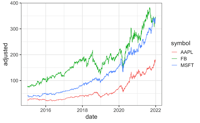
To make the line plot or time series plot for multiple companies, we specify color argument and specify the ticker names to plot different companies in different color.

stock_df %>%
  ggplot(aes(x=date, y=adjusted,  color=symbol))+
  geom_line()
ggsave("multi_company_stock_prices_over_time.png")
Visualizing Multiple Companies Stock Price Over Time

We can further customize the colors using scale_color_brewer() as another layer with a specific palette of interest.

stock_df %>%
  ggplot(aes(x=date, y=adjusted,  color=symbol))+
  geom_line(size=1)+
  scale_color_brewer(palette = "Set2")
ggsave("customizing_colors_stock_prices_over_time.png")
Customizing Colors: Multiple Stock Price Over Time

Related posts:

Month Name and Year with scale_x_date in ggplot2Visualizing Stock Price of a Single Company Over Time Customizing Mean mark to boxplot with ggplot2How To Show Mean Value in Boxplots with ggplot2? Scatterplot with marginal multi-histogram with ggExtraHow To Make Scatterplot with Marginal Histograms in R? ggforce geom_circle(): Annotate with a circleHow To Annotate a Plot with Circle in R

Filed Under: ggplot2, R Tagged With: Stock Price Over Time

Primary Sidebar

Tags

Altair barplot Boxplot boxplot python boxplot with jiitered text labels Bubble Plot Color Palette Countplot Density Plot Facet Plot gganimate ggplot2 ggplot2 Boxplot ggplot2 error ggplot boxplot ggridges ggtext element_markdown() Grouped Barplot R heatmap heatmaps Histogram Histograms Horizontal boxplot Python lollipop plot Maps Matplotlib Pandas patchwork pheatmap Pyhon Python R RColorBrewer reorder boxplot ggplot Ridgeline plot Scatter Plot Scatter Plot Altair Seaborn Seaborn Boxplot Stock Price Over Time Stripplot UpSetR Violinplot Violin Plot World Map ggplot2

Buy Me a Coffee

Copyright © 2025 · Daily Dish Pro on Genesis Framework · WordPress · Log in

Go to mobile version