Venn Diagrams are the bread and butter of visualizing intersections of multiple sets. One of the reasons for Venn Diagram is popular because it is simple and intuitive. However, when you have more than three sets, Venn Diagram gets really complicated to make sense.
UpSet plots are a great replacement for Venn Diagram for visualize intersections of two or more sets. In this post, we will use the R package UpSetR and make simple upset plots using a toy example.
library(UpSetR)
Let us create some simple data to make intersections using UpSetR. Here we sample 6 numbers with replacements from between 1 and 10. We create four such sets: a,b,c, and d.
set.seed(42)
a = sample(1:6,10,replace=T)
b = sample(1:6,10,replace=T)
c = sample(1:6,10,replace=T)
d = sample(1:6,10,replace=T)
We can see that we have four sets with different number of common elements between them. In this post, we will see how to visualize the overlap of multiple sets like these using UpSet plots.
print(unique(a))
## [1] 1 5 2 4
print(unique(b))
## [1] 1 5 6 4 2 3
print(unique(c))
## [1] 4 5 2 3 1
print(unique(d))
## [1] 2 6 3 4 5
UpSet Plot Example With Two Sets
Let us consider a simple example with two sets. With Venn diagram, when we compare two sets, we will have intersection between two sets, and two numbers unique to each set.
UpSet visualizes intersections among the sets
in a matrix layout and introduces aggregates based on groupings and queries. The matrix layout enables the effective representation of associated data, such as the number of elements in the aggregates and intersections, as well as additional summary statistics derived from subset or element attributes.
list_input <- list(a=a,b=b)
upset(fromList(list_input))
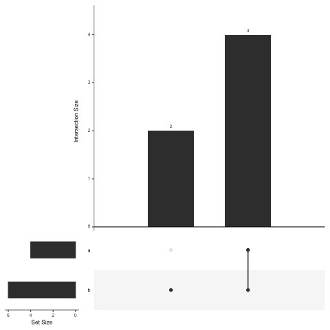
list_input <- list(a=a,b=b)
# UpSet Plot Ordered by frequency
upset(fromList(list_input),
      order.by = "freq")
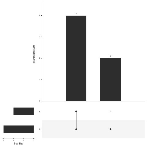
list_input <- list(a=a,b=b)
upset(fromList(list_input),
      order.by = "freq",
      text.scale=2,
      point.size = 3,
      line.size = 1.5)
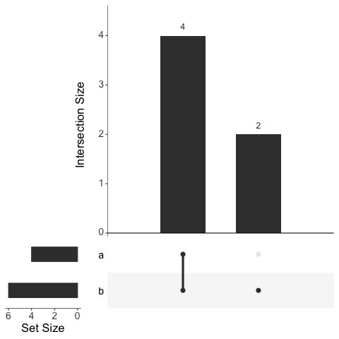
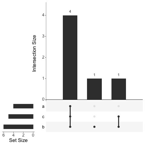
UpSet Plot Example With Three Sets
list_input <- list(a=a,b=b,c=c)
upset(fromList(list_input),
      order.by = "freq",
      text.scale=2,
      point.size = 3,
      line.size = 1.5)
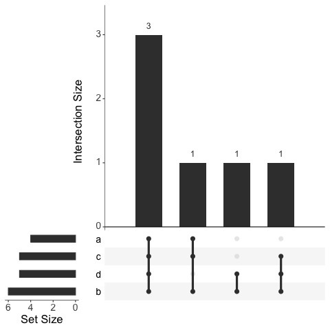
UpSet Plot Example With Four Sets
list_input <- list(a=a,b=b,c=c,d=d)
# Visualizing_Intersection_of_Four_sets_with_upset_plot
upset(fromList(list_input),
      order.by = "freq",
      text.scale=2,
      point.size = 3,
      line.size = 1.5)