Last updated on June 18, 2021
Violinplot or boxplot? What is better? Boxplots is great visualization to show a numerical variable. A boxplot shows “four main features about a variable: center, spread, asymmetry, and outliers”. With the five summary statistics one can easily draw boxplot even by hand. Violin plots are very similar to boxplot. In addition to the four main features, violin plot also shows density of the variable.
Violin plot Introduction
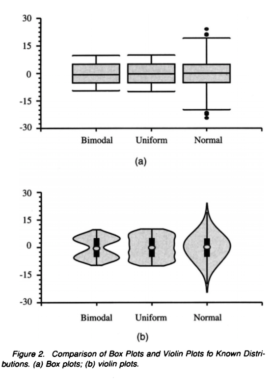
Hintze and Nelson, introducing violin plot nicely explains,
The violin plot, introduced in this article, synergistically combines the box plot and the density trace (or smoothed histogram) into a single display that reveals structure found within the data
The answer to the question when violinplot can be more useful than boxplot is beautifully illustrated in the paper with a simple example.
Datasets for Violin plot vs Boxplot in R
In this post, we simply use the above illustration to show violin plots with added density information in the plot can capture the distribution better compared to boxplot.
Let us load tidyverse.
library(tidyverse)
theme_set(theme_bw(16))
We will create data set from three known distributions. The first one is a bimodal distribution constructed from two normals with different means. Second distribution is uniform distribution and the third one is normal distribution.
bimodal <- c(rnorm(100,4),rnorm(100,8))
uniform <- c(runif(200,min=4,max=8))
normal <- c(rnorm(200,6,sd=3))
Let us save the variables in a data frame.
df <- data.frame(bimodal=bimodal,
                 uniform=uniform,
                 normal=normal)
head(df)
And the data frame we created is in wide form.
##    bimodal  uniform    normal
## 1 4.175995 4.377581  8.524080
## 2 3.087226 6.398855  1.476934
## 3 3.639397 5.656345  6.392939
## 4 2.582552 7.022062 11.004548
## 5 5.145716 5.702256  5.632917
## 6 4.905422 7.163434  8.862110
Let us use pivot_longer() function in tidyr to reshape the wide data frame to tidy form.
df_tidy <- df %>%
  pivot_longer(cols=bimodal:normal,values_to = "obs", names_to = "grp")
And now we are ready make boxplots and violinplots.
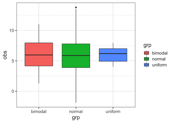
Boxplots with geom_boxplot()
Let us make boxplot using geom_boxplot() function.
df_tidy %>%
  ggplot(aes(x=grp,y=obs, fill=grp))+
  geom_boxplot()
We can see that three different distributions look kind of the same. Mainly because their median values are approximately the same.
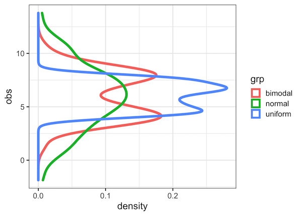
Density plots with geom_density()
Violin plot combines desnity information to boxplot. Let us see how does density of these three distributions compare.
df_tidy %>%
  ggplot(aes(col=grp,y=obs))+
  geom_density(size=2)
We can see that, the way we constructed the data is such that they vary in density a lot.
Violinplots with geom_violin()
Let us make violinplots, which combines boxplot with density plots, using ggplot2’s geom_violin() function.
df_tidy %>%
  ggplot(aes(x=grp,y=obs, fill=grp))+
  geom_violin()+
  theme(legend.position="none")
We can immediately see that although median values of the three distributions are similar, they are distributed differently.
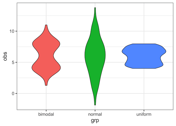
With the added density information, violin plot nicely reveal the structure in the data, while a boxplot does not. And this is why violin plot is better than boxplot, when you have enough data to estimate the density.