In this tutorial, we will learn how to make violin plots using Python’s Matplotlib library. Matplotlib has a function called violinplot() and we will use that function to examples of making violinplot first and then learn to customize the violinplots.
Unlike other tutorials on violinplot with Matplotlib, here we start with data stored in a Pandas dataframe and show the distribution of multiple groups as violin plots.
Let us get started by loading Matplotlib and other needed packages.
import matplotlib.pyplot as plt
import numpy as np
import pandas as pd
We us Palmer penguin dataset to make violinplot and the data is available from datavizpyr.com’s github page.
penguins_data="https://raw.githubusercontent.com/datavizpyr/data/master/palmer_penguin_species.tsv"
# load penguns data with Pandas read_csv
df = pd.read_csv(penguins_data, sep="\t")
# remove rows with missing values
df = df.dropna()
df.head()

species	island	culmen_length_mm	culmen_depth_mm	flipper_length_mm	body_mass_g	sex
0	Adelie	Torgersen	39.1	18.7	181.0	3750.0	MALE
1	Adelie	Torgersen	39.5	17.4	186.0	3800.0	FEMALE
2	Adelie	Torgersen	40.3	18.0	195.0	3250.0	FEMALE
4	Adelie	Torgersen	36.7	19.3	193.0	3450.0	FEMALE
5	Adelie	Torgersen	39.3	20.6	190.0	3650.0	MALE
We will be making violin plot body mass for different penguin species. To get the the body mass data for three species in a list, we use group by on species and aggregate function on body mass variable
data = (df.
        groupby('species')["body_mass_g"].
        agg(lambda x: list(x)))
Our data for violin plot looks like this
data

species
Adelie       [3750.0, 3800.0, 3250.0, 3450.0, 3650.0, 3625....
Chinstrap    [3500.0, 3900.0, 3650.0, 3525.0, 3725.0, 3950....
Gentoo       [4500.0, 5700.0, 4450.0, 5700.0, 5400.0, 4550....
Name: body_mass_g, dtype: object
We can get the names from the index.
data.index

Index(['Adelie', 'Chinstrap', 'Gentoo'], dtype='object', name='species')
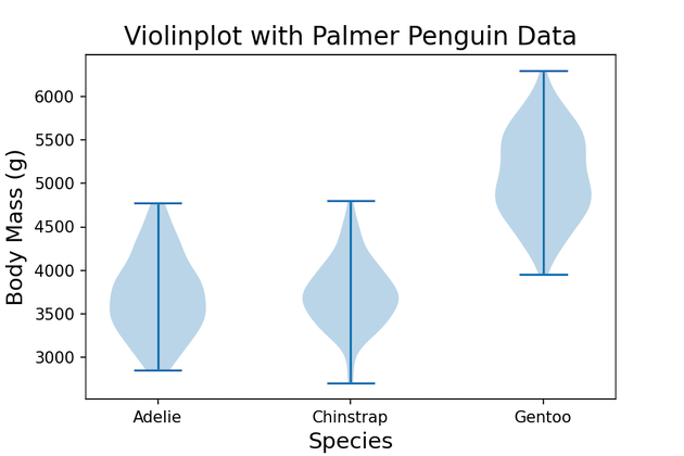
Default Violinplot with Matplotlib
Let us make violin plot using Matplotlib’s violinplot() function. By default, Matplotlib’s violin plot adds numbers on x-axis tick. Here set the x-axis tick using set_xticks() function with species names as labels. We also add axis labels and title to the violinplot.
labels = data.index
fig, ax = plt.subplots()
# make violinplot
ax.violinplot(data)
# set x-axis tick labels
ax.set_xticks(np.arange(1, len(labels) + 1), labels=labels)
plt.xlabel("Species",
            size=14)
plt.ylabel("Body Mass (g)",
            size=14)
plt.title("Violinplot with Palmer Penguin Data",
            size=16)
plt.savefig("Violinplot_matplotlib_python.png",
                    format='png',dpi=150)
Violinplot made with Matplotlib looks like this with blue color fill and line showing the extreme values.

Add Median value to Violinplot with Matplotlib
To customize the violinplot further, let us add median values as a point to the violinplot. To do that let us first compute median values for each group.
medians = (df.
           groupby('species')["body_mass_g"].
           median())
First, we make violinplot as before. And then we add the median values to the violinplot by using scatter() function from Matplotlib.
inds = np.arange(1, len(medians) + 1)
labels = data.index

fig, ax = plt.subplots()
ax.violinplot(data,
             showextrema=False)
ax.scatter(inds, medians, marker='o', color='red', s=30, zorder=3)
ax.set_xticks(np.arange(1, len(labels) + 1), labels=labels)
plt.xlabel("Species",
            size=14)
plt.ylabel("Body Mass (g)",
            size=14)
plt.title("Violinplot with Palmer Penguin Data",
            size=16)
plt.savefig("Customizing_Violinplot_matplotlib_python.png",
                    format='png',dpi=150)
We have median values as red point on the violin plot. In addition, we have also specified not to show the extreme values as lines. Everything else is the same as before.

Add lower and upper quartile ranges to Violinplot with Matplotlib
It will be great to further customize the violinplot by adding lower and upper quartile values on the violinplot. To do that, we will first compute them using quantile() function in Pandas.
quartile1 = (df.
             groupby('species')["body_mass_g"].
             quantile(0.25))
quartile1

species
Adelie       3362.5
Chinstrap    3487.5
Gentoo       4700.0
Name: body_mass_g, dtype: float64
quartile3 = (df.
             groupby('species')["body_mass_g"].
             quantile(0.75))
quartile3

species
Adelie       4000.0
Chinstrap    3950.0
Gentoo       5500.0
Name: body_mass_g, dtype: float64
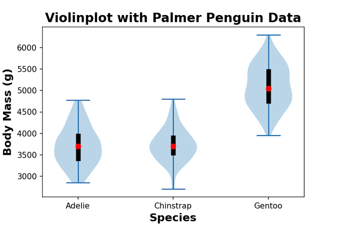
Now in addition to violinplot and the median values, we add vertical lines to the quartile ranges.
inds = np.arange(1, len(medians) + 1)
fig, ax = plt.subplots()
ax.violinplot(data,
              #showmeans=True,
              #showmedians=True,
             showextrema=True)
# set style for the axes
labels = data.index
# add median value as a point
ax.scatter(inds, medians, marker='o', color='red', s=40, zorder=3)
# Add boxplot-like vertical lines to show the first and third quartile
ax.vlines(inds, quartile1, quartile3, color='k', linestyle='-', lw=6)
ax.set_xticks(np.arange(1, len(labels) + 1), labels=labels)
plt.xlabel("Species",
            fontweight ='bold',
            size=14)
plt.ylabel("Body Mass (g)",
            fontweight ='bold',
            size=14)
plt.title("Violinplot with Palmer Penguin Data",
            fontweight ='bold',
            size=16)
#plt.show()
plt.savefig("Customizing_Violinplot_matplotlib_python_2.png",
                    format='png',dpi=150)
And this gives a nice boxplot-like look showing the quartile values.