Violin plots are great way visualize continuous data distributions from multiple groups or categories. Violin plots are a lot like boxplot. Basically Violin plot is combination of boxplot and density plot. The shape of the density resembles a violin’s shape. Violinplot quickly shows the summary level stats of a numerical variable with multiple groups.
In this post, we will learn how to make violinplots using Seaborn in Python using two different Seaborn functions. Let us first load Seaborn, matplotlib and pandas packages for creating data and making a simple violin plot in Python.
import seaborn as sns
import matplotlib.pyplot as plt
import pandas as pd
Let us use weather data vega datasets to make violin plot across multiple weather conditions in Seattle. We will use Pandas’ read_csv to directly load the data from website.
weather_df = pd.read_csv("https://raw.githubusercontent.com/vega/vega-datasets/master/data/weather.csv")
weather_df.head()
  location        date  precipitation  temp_max  temp_min  wind  weather
0  Seattle  2012-01-01            0.0      12.8       5.0   4.7  drizzle
1  Seattle  2012-01-02           10.9      10.6       2.8   4.5     rain
2  Seattle  2012-01-03            0.8      11.7       7.2   2.3     rain
3  Seattle  2012-01-04           20.3      12.2       5.6   4.7     rain
4  Seattle  2012-01-05            1.3       8.9       2.8   6.1     rain
There are are at least two ways to make violin plots in Seaborn. One way is to use Seaborn’s latest “catplot” function which generalizes all categorical plot under a single function.
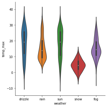
How to Make Violin Plot using Catplot function in Searborn?
To make a violin plot using Seaborn’s catplot function, we need to specify the kind of plot we need using the argument “kind=violin”.
sns.catplot(x="weather",
            y="temp_max",
            kind="violin",
            data=weather_df)
We have a basic violin plot using Seaborn’s catplot function.
How to Make Violin Plot using violinplot() function in Searborn?
Another way to make violin plot using Seaborn is to use Seaborn’s older function violinplot(). We can use violinplot() function with x, y, and data argument as follows.
sns.violinplot(x="weather",
               y="temp_max",
               kind="violin",
               data=weather_df)
And this is how the simple violin plot using violinplot() function in Seaborn looks like.
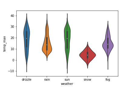
The violin plot made from Seaborn’s catplot() function and Seaborn’s violinplot() function are almost identical except for the plot dimension.