Making tables as part of your data visualization strategy can be a hit or miss. For example, a table with too many numbers screams for a plot instead of a table. Basically, challenge lies in using tables at the right time in right way. Luckily, we are in a much better position to make beautiful tables using R. In this post, we will see 6 simple tips to get started with making tables using the R package gt. The R package gt is developed and maintained by RStudio
With the gt package, anyone can make wonderful-looking tables using the R programming language. The gt philosophy: we can construct a wide variety of useful tables with a cohesive set of table parts. These include the table header, the stub, the column labels and spanner column labels, the table body, and the table footer.
Let us load the R packages needed.
library(tidyverse)
library(gt)
library(palmerpenguins)
We will use the palmer penguin dataset to create a summary table of average species’ body mass.
df <- penguins %>%
  drop_na() %>%
  group_by(species) %>%
  summarize(mean_body_mass = mean(body_mass_g))
Out simple data frame looks like this and we would make table from this dataframe.
df
## # A tibble: 3 x 2
##   species   mean_body_mass
##   <fct>              <dbl>
## 1 Adelie             3706.
## 2 Chinstrap          3733.
## 3 Gentoo             5092.
1. Simple table with gt
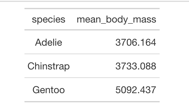
With gt(), we can make a simple table by providing the dataframe to gt() function
# a simple gt table
df %>% gt()
And we get a simple table that looks like this.
2. How to Add a Title to a Table with gt?
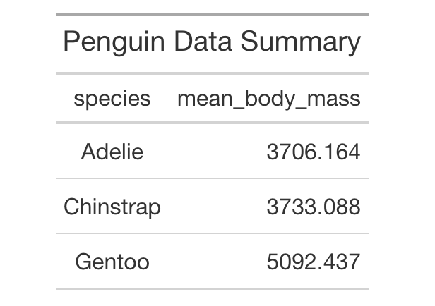
It will be nice to add a title to our table. We can add title to a table in gt using tab_header() function as shown below. Within tab_header() function, we specify “title” argument with the title text we want.
df %>%
  gt()%>%
  tab_header(
    title = "Penguin Data Summary"
  )
Now our simple table has a title.
3. How to Make the Title bold with markdown?
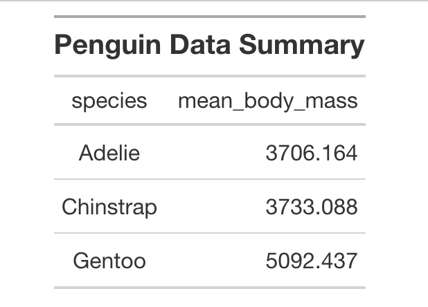
We can make our title bold using markdown inside tabe_header() function. Here we can simply use markdown syntax to do this.
df %>%
  gt()%>%
  tab_header(
    title = md("**Penguin Data Summary**")
  )
4. How to Format Numbers in gt with fmt_number()?
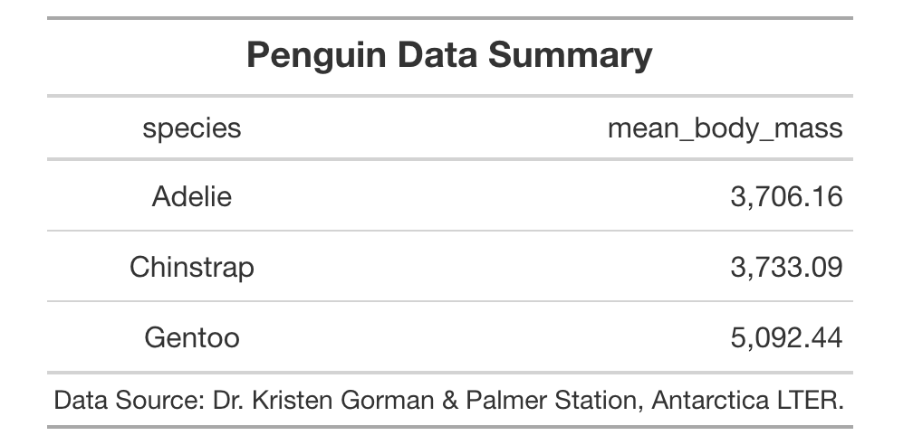
A table with numbers can often be difficult read. One way to make it easy to read is to format the numbers. Here we use fmt_number() function to format the numbers with place value and show just two decimal points. We specify which column to format.
df %>%
  gt()%>%
  tab_header(
    title = md("**Penguin Data Summary**")
  ) %>%
 fmt_number(
    columns = vars(mean_body_mass),
    decimals = 2
  )
5. How to Add Source Note using gt table?
We can add source note at the bottom of the table using gt’s tab_source_note() function. We specify the text we want as source note using “source_note” as argument.
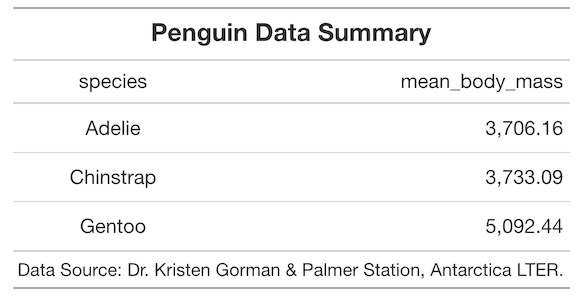
df %>%
  gt()%>%
  tab_header(
    title = md("**Penguin Data Summary**")
  ) %>%
  fmt_number(
    columns = vars(mean_body_mass),
    decimals = 2
  ) %>%
  tab_source_note(
    source_note = "Data Source: Dr. Kristen Gorman & Palmer Station, Antarctica LTER."
  )
6. How to Highlight one or more rows with color in gt?
Adding colors to either select rows or columns can help highlight part of the table. With gt, we can selectively add colors to rows or columns using tab_style() function.
In the example below, we specify colors using “style” argument. We specify the condition for highlighting rows using locations as shown below. Here we highlight the row with mean body mass is greater than 4000 in green color.
df %>%
  gt()%>%
  tab_header(
    title = md("**Penguin Data Summary**")
  ) %>%
 fmt_number(
    columns = vars(mean_body_mass),
    decimals = 2
  ) %>%
  tab_source_note(
    source_note = "Data Source: Dr. Kristen Gorman & Palmer Station, Antarctica LTER."
  ) %>%
  tab_style(
    style = list(
      cell_fill(color = "green"),
      cell_text(weight = "bold")
      ),
    locations = cells_body(
      columns = vars(species,mean_body_mass),
      rows = mean_body_mass >= 4000)
  )


