• Skip to primary navigation
  • Skip to main content
  • Skip to primary sidebar

Data Viz with Python and R

Learn to Make Plots in Python and R

  • Home
  • Python Viz
  • Seaborn
  • Altair
  • R Viz
  • ggplot2
  • About
    • Privacy Policy
  • Show Search
Hide Search

Stock Return Barplot

Visualizing Stock Return of a Company Over Time with Barplots

datavizpyr · December 4, 2021 ·

Coloring Barplots Based on Sign: Stock Return

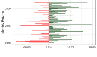
In this tutorial, we will learn how to visualize a company’s stock return over time. A stock's return is defined as the capital gains/losses and income from dividend. We will use the adjusted stock price to compute the nominal return using the fantastic tidyquant R … [Read more...] about Visualizing Stock Return of a Company Over Time with Barplots

Filed Under: ggplot2, R Tagged With: Stock Return Barplot

Primary Sidebar

Tags

Altair barplot Boxplot boxplot python boxplot with jiitered text labels Bubble Plot Color Palette Countplot Density Plot Facet Plot gganimate ggplot2 ggplot2 Boxplot ggplot2 error ggplot boxplot ggridges ggtext element_markdown() Grouped Barplot R heatmap heatmaps Histogram Histograms Horizontal boxplot Python lollipop plot Maps Matplotlib Pandas patchwork pheatmap Pyhon Python R RColorBrewer reorder boxplot ggplot Ridgeline plot Scatter Plot Scatter Plot Altair Seaborn Seaborn Boxplot Stock Price Over Time Stripplot UpSetR Violinplot Violin Plot World Map ggplot2

Buy Me a Coffee

Copyright © 2025 · Daily Dish Pro on Genesis Framework · WordPress · Log in

Go to mobile version