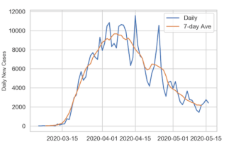
Time Series plots are a great way to see a trend over a period of time. However, if the numerical variable that we are plotting in time series plot fluctuates day to day, it is often better to add a layer moving average to the time series plot. In this post, we will see … [Read more...] about How to Make a Time Series Plot with Rolling Average in Python?
Seaborn
How To Make Scatter Plot with Regression Line using Seaborn?

Adding regression line to a scatterplot between two numerical variables is great way to see the linear trend. In this post, we will see two ways of making scatter plot with regression line using Seaborn in Python. And we will also see an example of customizing the scatter plot … [Read more...] about How To Make Scatter Plot with Regression Line using Seaborn?
How to Make Countplot or barplot with Seaborn Catplot?

Sometimes you might want to make countplot or barplots in Python, but the data may not in the right format. For example, you might want to make countplot/barplot of the number of things corresponding to multiple categorical variables. However, the data may in the form such that … [Read more...] about How to Make Countplot or barplot with Seaborn Catplot?
How To Order Bars in Barplot using Seaborn in Python?
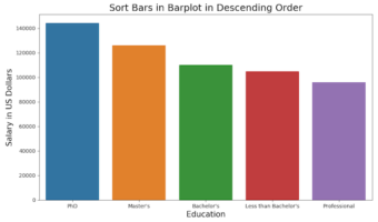
Barplots are a great way to visualize the relationship between categorical variables and their corresponding quantitative values. However, the default order of categories in Seaborn is often alphabetical, which may not be meaningful. Sorting the bars makes comparisons easier and … [Read more...] about How To Order Bars in Barplot using Seaborn in Python?
How To Make Stripplot using Seaborn Catplot?
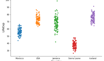
Stripplots are like scatter plots but one of the variables is a categorical variable. Stripplots are a great addition to boxplots as it shows complete data on the plot. Stripplots are more useful when can add random noise called "jitter" to avoid overlapping of data points with … [Read more...] about How To Make Stripplot using Seaborn Catplot?