
Bubble plots are scatter plots with bubbles (color filled circles) instead of data points. Bubbles have different sizes based on another variable in the data. Also bubbles can be of different color based on another variable in the dataset. Let us load the libraries needed. 👉 … [Read more...] about How To Make Bubble Plot with Seaborn Scatterplot in Python?
Seaborn
How To Place Legend Outside the Plot with Seaborn in Python?
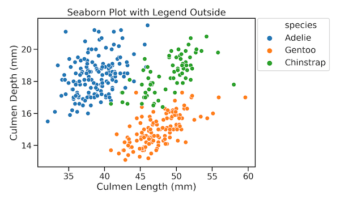
While making plots with legend, like scatterplot, Seaborn has a nice feature that finds a suitable place for legend and puts it automatically inside the plot. This greatly helps in utilizing plotting area efficiently. However, sometimes you might want the legend outside the plot. … [Read more...] about How To Place Legend Outside the Plot with Seaborn in Python?
How To Make Scatter Plots with Seaborn scatterplot in Python?

Scatter plots are one of the most powerful ways to visualize the relationship between two quantitative variables. With Python’s Seaborn library, you can easily enhance scatter plots by adding more dimensions using color, shape, and size. In this tutorial, you’ll learn 9 tips … [Read more...] about How To Make Scatter Plots with Seaborn scatterplot in Python?
How to Show and Customize Mean Values in Seaborn Boxplots

Want to display both median and mean values in your boxplot visualizations? This comprehensive guide shows you exactly how to seaborn boxplot show mean using multiple methods, with ready-to-use Python code examples. Boxplots traditionally show median values, but displaying the … [Read more...] about How to Show and Customize Mean Values in Seaborn Boxplots
How To Annotate Bars in Barplot with Matplotlib in Python?

In this post we will learn examples of adding text, annotating bars in barplot using matplotlib. We will make bar plots using Seaborn's barplot and use Matplotlib to add annotations to the bars in barplot. Let us load Pandas, Seaborn and Matplotlib. Let us create a toy … [Read more...] about How To Annotate Bars in Barplot with Matplotlib in Python?