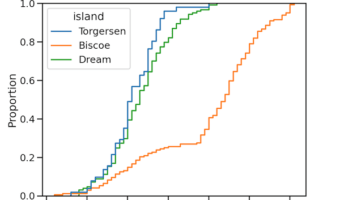
ECDF plot, aka, Empirical Cumulative Density Function plot is one of the ways to visualize one or more distributions. In this post, we will learn how to make ECDF plot using Seaborn in Python. Till recently, we have to make ECDF plot from scratch and there was no out of the … [Read more...] about How to Make ECDF plot with Seaborn in Python?
Seaborn
How To Make Violinpot with data points in Seaborn?

Violinplots are combination of boxplot and density plots. In this tutorial we will learn how to make Violinplots with Seaborn in Python and also show actual data points with violin plot. 👉 Want more? Explore the full Seaborn Tutorial Hub with 35+ examples, code recipes, and … [Read more...] about How To Make Violinpot with data points in Seaborn?
Seaborn set_context() to adjust size of plot labels and lines
One of the challenges in making data visualization is making all aspects of a plot clearly visible. Often, you might see where the axis labels, tick labels are too small and not legible at all. Challenge is that the required sizes of plot aspects like labels, points, lines are … [Read more...] about Seaborn set_context() to adjust size of plot labels and lines
How To Add Regression Line Per Group with Seaborn in Python?
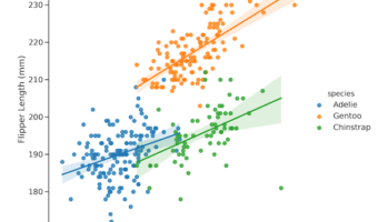
In this tutorial, we will learn how to add regression line per group to a scatter plot with Seaborn in Python. Seaborn has multiple functions to make scatter plots between two quantitative variables. For example, we can use lmplot(), regplot(), and scatterplot() functions to make … [Read more...] about How To Add Regression Line Per Group with Seaborn in Python?
How to Make Grouped Violinplot with Seaborn in Python?

In this tutorial, we will learn how to make grouped violinplots with Seaborn in Python. In Seaborn, we have atleast two ways to make violinplots using Seaborn in Pyhon. First is to use violinplot() function and make violinplot. And the second option is to use Seaborn's … [Read more...] about How to Make Grouped Violinplot with Seaborn in Python?