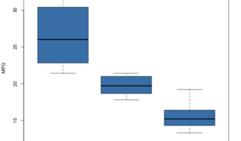
In this post, we will learn how to make simple boxplots using base R function boxplot(). We will use mtcars dataset available readily in R to first make a simple boxplot using boxplot() function in base R. And then we will learn how to customize the boxplot with specifying x and … [Read more...] about How To Make Boxplots in base R?
R
How to Make Horizontal Boxplot with ggplot2 version 3.3.0?

Making a boxplot or barplot horizontally can be useful in a variety of scenarios. In ggplot2, till now the only way to make a plot horizontal is to use flip the axis using coord_flip(). With ggplot2 version 3.3.0, we can easily flip axis and make horizontal boxplot or horizontal … [Read more...] about How to Make Horizontal Boxplot with ggplot2 version 3.3.0?
Multiple Line Plots or Time Series Plots with ggplot2 in R
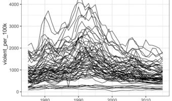
Line plots or time series plots are helpful to understand the trend over time. In this post we will learn how to make multiple line plots (or time-series plots in the sample plot) in R using ggplot2. Let us load tidyverse the suite of R packages including ggplot2 to make the … [Read more...] about Multiple Line Plots or Time Series Plots with ggplot2 in R
How To Make Ridgeline Plot with ggridges in R?
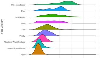
Ridgeline plot is one of the data visualization techniques that is suitable for visualizing multiple distributions or changes in distributions over time or space. Claus Wilke made created this plot and a package in R to make this easily. He defines it as a partially overlapping … [Read more...] about How To Make Ridgeline Plot with ggridges in R?
How To Make Violin Plots with ggplot2 in R?
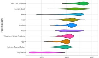
Violin plots are a way visualize numerical variables from one or more groups. Violin plots are similar to box plots. A boxplot shows a numerical distribution using five summary level statistics. Violin plots have the density information of the numerical variables in addition to … [Read more...] about How To Make Violin Plots with ggplot2 in R?