Faceting in ggplot2 is one of the most powerful ways to create small multiples—a series of plots split by a grouping variable. With facet_wrap() and facet_grid(), you can easily compare distributions, trends, or relationships across categories. New to facets? Start here: How … [Read more...] about How To Customize Border in facet in ggplot2
R
How To Make PCA Plot with R
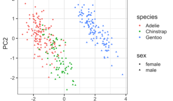
Principal Component Analysis (PCA) is one of the commonly used methods used for unsupervised learning. Making plots using the results from PCA is one of the best ways understand the PCA results. Earlier, we saw how to make Scree plot that shows the percent of variation explained … [Read more...] about How To Make PCA Plot with R
How to Change X and Y Axis Values from Real to Integers in ggplot2
When you make a plot with ggplot2, it automatically chooses appropriate range for x and y-axis values and it can be either floats or integers. In this post, we will see how to change X/Y-axis values to integers. In ggplot2, we can use scale_x_continuous() and scale_y_continuous() … [Read more...] about How to Change X and Y Axis Values from Real to Integers in ggplot2
How To Join Multiple ggplot2 Plots with cowplot?

Combining or joining multiple plots made with ggplot2 into a single plot is often very useful in telling a story with data. Now we have multiple options in R, including patchwork, gridExtra, and cowplot to join multiple plots made by ggplot2. In this post, we will see how to use … [Read more...] about How To Join Multiple ggplot2 Plots with cowplot?
How To Make Dumbbell Plot in R with ggplot2?

Dumbbell plots or connected dot plots are a great way to visualize change in something over time for multiple groups. Dumbbell plots are a great alternative to grouped barchart as dumbbell plot uses much less ink on the paper and is much simpler to understand. We can use … [Read more...] about How To Make Dumbbell Plot in R with ggplot2?