• Skip to primary navigation
  • Skip to main content
  • Skip to primary sidebar

Data Viz with Python and R

Learn to Make Plots in Python and R

  • Home
  • Python Viz
  • Seaborn
  • Altair
  • R Viz
  • ggplot2
  • About
    • Privacy Policy
  • Show Search
Hide Search

Python

Scatter Plot with Regression Line using Altair in Python

datavizpyr · December 15, 2019 ·

Scatter plot with regression line using Altair

Adding regression line to scatter plot is a great way to understand the relationship between two numeric variables. In this post, we will see an example of using Altair to make a scatter plot with regression line using real world dataset. Let us load the packages we need. … [Read more...] about Scatter Plot with Regression Line using Altair in Python

Filed Under: Altair, Python, Scatter Plot Altair Tagged With: Altair, Python

How To Make Histogram with Median Line using Altair in Python?

datavizpyr · December 15, 2019 ·

Histogram with Median Line with Altair

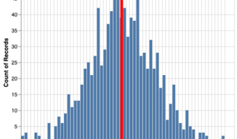
In this post we will learn how to make a histogram with a median line using Altair in Python. This is also a great example illustrating the power of Altair's grammar of graphics. Let us load the packages needed to make histogram with a median or mean line using … [Read more...] about How To Make Histogram with Median Line using Altair in Python?

Filed Under: Altair, Histogram with Altair, Python Tagged With: Python

How To Make Boxplots with Seaborn in Python?

datavizpyr · December 14, 2019 ·

Boxplot with Catplot Seaborn Python

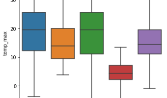
Boxplot is a way to visualize quantitative/numeric variable, in a concise way using quartiles of a data distribution. Here, we will see examples of making simple boxplots using Seaborn in Python. Let us first load packages needed for making boxplot. We will use weather … [Read more...] about How To Make Boxplots with Seaborn in Python?

Filed Under: Python, Python Boxplot, Seaborn, Seaborn Boxplot Tagged With: Boxplot, Python, Seaborn

How to Make Violin Plot with Seaborn in Python?

datavizpyr · December 14, 2019 ·

Violin plot with Seaborn

Violin plots are great way visualize continuous data distributions from multiple groups or categories. Violin plots are a lot like boxplot. Basically Violin plot is combination of boxplot and density plot. The shape of the density resembles a violin's shape. Violinplot quickly … [Read more...] about How to Make Violin Plot with Seaborn in Python?

Filed Under: Python, Python Violin Plot, Seaborn, Seaborn Violin Plot Tagged With: Python, Python Violinplot, Seaborn Violinplot

How to Make a Simple Histogram with Altair in Python?

datavizpyr · December 13, 2019 ·

Histogram with Altair

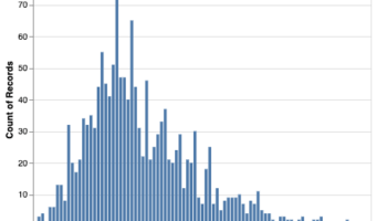
Altair is the newest to Pyhon's Data Visualization landscape. In this post we will see a simple example of making a histogram using Python's Altair package. Let us import Altair as alt and also import data from vega_datasets. We will use weather data set from … [Read more...] about How to Make a Simple Histogram with Altair in Python?

Filed Under: Altair, Histogram with Altair, Python Tagged With: Python

  • « Go to Previous Page
  • Page 1
  • Interim pages omitted …
  • Page 12
  • Page 13
  • Page 14
  • Page 15
  • Go to Next Page »

Primary Sidebar

Tags

Altair barplot Boxplot boxplot python boxplot with jiitered text labels Bubble Plot Color Palette Countplot Density Plot Facet Plot gganimate ggplot2 ggplot2 Boxplot ggplot2 error ggplot boxplot ggridges ggtext element_markdown() Grouped Barplot R heatmap heatmaps Histogram Histograms Horizontal boxplot Python lollipop plot Maps Matplotlib Pandas patchwork pheatmap Pyhon Python R RColorBrewer reorder boxplot ggplot Ridgeline plot Scatter Plot Scatter Plot Altair Seaborn Seaborn Boxplot Stock Price Over Time Stripplot UpSetR Violinplot Violin Plot World Map ggplot2

Buy Me a Coffee

Copyright © 2025 · Daily Dish Pro on Genesis Framework · WordPress · Log in

Go to mobile version