
In this tutorial, we will learn how to make horizontal violin plot in Seaborn with Python. With Seaborn, we can use two similar functions, catplot() and violinplot() to make violin plots. Making a violinplot horizontal with Seaborn is pretty simple. All we need to do is specify … [Read more...] about How to Make Horizontal Violin Plot with Seaborn in Python?
Python
Scatter Plot with Marginal Histograms in Python with Seaborn
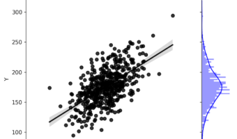
Sometimes when you make a scatter plot between two variables, it is also useful to have the distributions of each of the variables on the side as histograms. Scatter plots with marginal histograms on the side is a great way to do that. We can use Seaborn jointplot() function in … [Read more...] about Scatter Plot with Marginal Histograms in Python with Seaborn
Matplotlib Bar Plot in Python: Sort (Asc/Desc), Add Labels, Colors, Currency Axis & Horizontal Bars
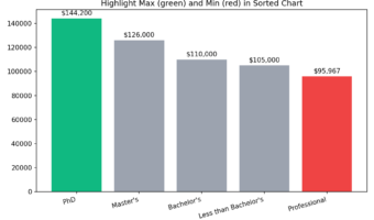
Why Sorting and Customizing Bar Plots Matters? Most bar charts need two upgrades to be useful: (1) put the categories in a meaningful order (ascending/descending), and (2) add polish (value labels, colors, readable axes, or horizontal layout for long names). This tutorial shows … [Read more...] about Matplotlib Bar Plot in Python: Sort (Asc/Desc), Add Labels, Colors, Currency Axis & Horizontal Bars
Area Chart with Altair in Python
In this post, we will see how to make simple area chart with Altair in Python. Area chart displays a quantitative variable like a line plot or density plot but coloring the area under the curve. In Altair, we can make area chart with mark_area() function. Let us first load … [Read more...] about Area Chart with Altair in Python
How To Make Bubble Plot in Python with Matplotlib?

In this post, we will learn how to make bubbleplots using Matplotlib in Python. Bubble plot is a scatterplot, but with size of the data point on the scatter plot is coded by another variable. Basically, if the third variable is larger you get a bigger circle filled with a color … [Read more...] about How To Make Bubble Plot in Python with Matplotlib?