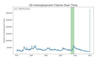
Time Series Plots are line plots with x-axis being date time instead of regular quantitative or ordered categorical variable. Sometimes you might want to highlight a region on a time series plot. In this post, we will learn how to highlight a time interval with a rectangular … [Read more...] about How To Highlight a Time Range in Time Series Plot in Python with Matplotlib?
Matplotlib
Overlapping Histograms with Matplotlib in Python
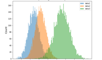
Histograms are one of the most common ways to visualize the distribution of data. While a single histogram shows the shape of one variable, often we want to compare two or more distributions directly. In this post, we’ll learn how to plot multiple overlapping histograms … [Read more...] about Overlapping Histograms with Matplotlib in Python
Matplotlib Bar Plot in Python: Sort (Asc/Desc), Add Labels, Colors, Currency Axis & Horizontal Bars
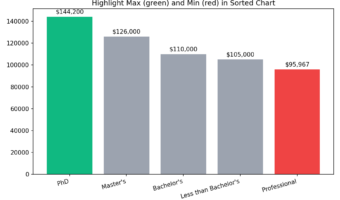
Why Sorting and Customizing Bar Plots Matters? Most bar charts need two upgrades to be useful: (1) put the categories in a meaningful order (ascending/descending), and (2) add polish (value labels, colors, readable axes, or horizontal layout for long names). This tutorial shows … [Read more...] about Matplotlib Bar Plot in Python: Sort (Asc/Desc), Add Labels, Colors, Currency Axis & Horizontal Bars
How To Make Bubble Plot in Python with Matplotlib?

In this post, we will learn how to make bubbleplots using Matplotlib in Python. Bubble plot is a scatterplot, but with size of the data point on the scatter plot is coded by another variable. Basically, if the third variable is larger you get a bigger circle filled with a color … [Read more...] about How To Make Bubble Plot in Python with Matplotlib?
Simple Scatter Plot with Matplotlib in Python
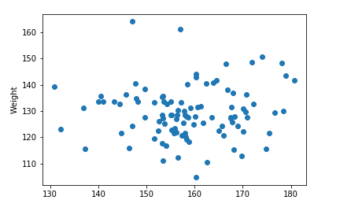
Matplotlib is one of the most popular plotting libraries in Python. As the name kind of hints, Matplotlib is bases on MATLAB style interface offers powerful functions to make versatile plots with Python. In this post, we will see examples of simple scatter plot with … [Read more...] about Simple Scatter Plot with Matplotlib in Python