
If you've ever stared at a column of numbers in a dataset and struggled to understand its underlying story, you're not alone. Raw data tells us little about the bigger picture. This is where the histogram shines. It's more than just a bar chart; it's your fastest tool for … [Read more...] about Histograms with Seaborn in Python
Histogram
How To Make Histograms with Matplotlib in Python?
If you've ever stared at a column of numbers in a dataset and struggled to understand its underlying story, you're not alone. While many libraries can create plots quickly, true mastery of Python visualization comes from understanding Matplotlib—the foundational engine that gives … [Read more...] about How To Make Histograms with Matplotlib in Python?
Overlapping Histograms with Matplotlib in Python
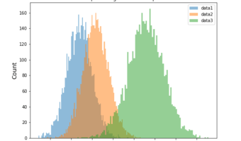
Histograms are one of the most common ways to visualize the distribution of data. While a single histogram shows the shape of one variable, often we want to compare two or more distributions directly. In this post, we’ll learn how to plot multiple overlapping histograms … [Read more...] about Overlapping Histograms with Matplotlib in Python
5 tips to make better histograms with ggplot2 in R

Histograms are of great use to visualize a uni-variate distribution. As ggplot2 defines, histograms "Visualise the distribution of a single continuous variable by dividing the x axis into bins and counting the number of observations in each bin." ggplot2's geom_histogram() … [Read more...] about 5 tips to make better histograms with ggplot2 in R
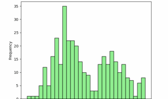
How to Add Outline/Edge Color to Histogram in Seaborn?

In this tutorial, we will see an example of adding edge color/edge line to histograms made with Seaborn. Let us load the packages needed to make histogram with outlines using Seaborn. We will use Seattle weather data from vega_datasets to make histograms. Let us … [Read more...] about How to Add Outline/Edge Color to Histogram in Seaborn?