• Skip to primary navigation
  • Skip to main content
  • Skip to primary sidebar

Data Viz with Python and R

Learn to Make Plots in Python and R

  • Home
  • Seaborn
  • Matplotlib
  • ggplot2
  • Altair
  • About
    • Privacy Policy
  • Visualizing Activation Functions in Neural Networks
  • Confusion Matrix Calculator
  • Visualizing Dropout Rate in Neural Network
  • Visualizing Loss Functions in Neural Networks
  • Show Search
Hide Search

Grouped violin plot with geom_sina()

How to Make Grouped Violinplot with jittered data points in R

datavizpyr · July 3, 2022 ·

Grouped violin plot with jittered points using geom_sina() in ggforce

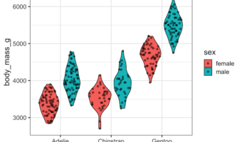
In this post, we will learn how to make grouped violin plot with jittered data points on top of it using ggplot2 in R. One of the challenges in making grouped violin or box plots with jittered data points is proper alignment of data points and the underlying plot. In an earlier … [Read more...] about How to Make Grouped Violinplot with jittered data points in R

Filed Under: geom_sina in ggforce, ggplot2, R Tagged With: Grouped violin plot with data points, Grouped violin plot with geom_sina()

Primary Sidebar

Python & R Viz Hubs

  • Seaborn Guide & Cookbook
  • ggplot2 Guide & Cookbook
  • Matplotlib Guide & Cookbook
  • Confusion Matrix Calculator
  • Visualizing Activation Functions
  • Visualizing Dropout
  • Visualizing Loss Functions

Buy Me a Coffee

Copyright © 2026 · Daily Dish Pro on Genesis Framework · WordPress · Log in

Go to mobile version