• Skip to primary navigation
  • Skip to main content
  • Skip to primary sidebar

Data Viz with Python and R

Learn to Make Plots in Python and R

  • Home
  • Seaborn
  • Matplotlib
  • ggplot2
  • Altair
  • About
    • Privacy Policy
  • Visualizing Activation Functions in Neural Networks
  • Confusion Matrix Calculator
  • Visualizing Dropout Rate in Neural Network
  • Visualizing Loss Functions in Neural Networks
  • Show Search
Hide Search

Grouped Barplot R

How to Make Grouped/Stacked Barplot in R?

datavizpyr · February 25, 2021 ·

Grouped Barplot with position="dodge"

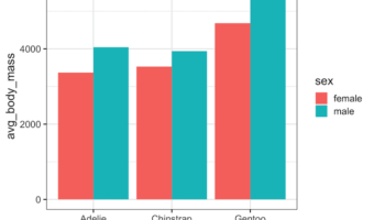
When you have dataset with two categorical variables and one quantitative variable, a grouped barplot is a great way to see the relationship among the variable. In a simple barplot, we have categorical variable on x-axis and have bars showing the numerical value of the … [Read more...] about How to Make Grouped/Stacked Barplot in R?

Filed Under: ggplot2, R Tagged With: barplot with bars side by side, Grouped Barplot R

How To Add Labels to Grouped Barplot with Bars Side-By-Side in R?

datavizpyr · June 19, 2020 ·

Customizing Labels on Bars in Side by side Stacked Barplot

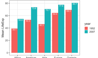
In this post we will learn how to add labels to bars on barplot that is stacked side-by-side. We will start with making side-by-side grouped barplot and work our way through adding annotation on top of each bar of the stacked barplot. Adding annotation to grouped barplot with … [Read more...] about How To Add Labels to Grouped Barplot with Bars Side-By-Side in R?

Filed Under: add labels to grouped barplot, ggplot2, R Tagged With: barplot, ggplot2, Grouped Barplot R, R

Primary Sidebar

Python & R Viz Hubs

  • Seaborn Guide & Cookbook
  • ggplot2 Guide & Cookbook
  • Matplotlib Guide & Cookbook
  • Confusion Matrix Calculator
  • Visualizing Activation Functions
  • Visualizing Dropout
  • Visualizing Loss Functions

Buy Me a Coffee

Copyright © 2026 · Daily Dish Pro on Genesis Framework · WordPress · Log in

Go to mobile version