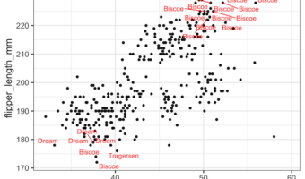
In this post, we will see how to add labels or annotations to select data points such that the labels don't overlap with each other. We will use the R package ggrepel together with ggplot to add labels without overlaps. More specifically we will use geom_text_repel() function … [Read more...] about How to Add Labels to Select Points with ggrepel?
ggplot2
6 Tips to Make Beautiful Tables with R Package gt
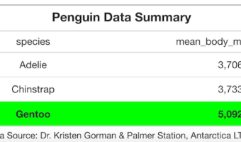
Making tables as part of your data visualization strategy can be a hit or miss. For example, a table with too many numbers screams for a plot instead of a table. Basically, challenge lies in using tables at the right time in right way. Luckily, we are in a much better position … [Read more...] about 6 Tips to Make Beautiful Tables with R Package gt
How To Make Half Violinplot with ggplot2 in R?

Violinplots are a great alternative to boxplot to visualize distribution of multiple variables. In this turtorial, we will learn about, half violin plot, a variant of violinplot in R with ggplot2. It is literally half of a violinplot, in a meaningful way. We will see examples … [Read more...] about How To Make Half Violinplot with ggplot2 in R?
How To Make Violinplot with Data Points in R?

Violinplots are a great alternative to boxplot, as it combines boxplot and density plot. In this tutorial, we will see examples of how to make violinplots with using ggplot2's geom_violin() function. Violinplots are like boxplot for visualizing numerical distributions for … [Read more...] about How To Make Violinplot with Data Points in R?
How To Remove facet_wrap Title Box in ggplot2?
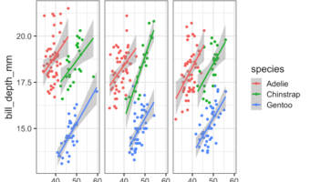
In this tutorial, we will see how to remove box surrounding title of each facets made with facet_wrap() function in ggplot2. Let us load tidyverse and set ggplot2 theme_bw() with base size 16. Let us use Palmer penguin dataset to make plots with facets using facet_wrap() in … [Read more...] about How To Remove facet_wrap Title Box in ggplot2?