• Skip to primary navigation
  • Skip to main content
  • Skip to primary sidebar

Data Viz with Python and R

Learn to Make Plots in Python and R

  • Home
  • Seaborn
  • Matplotlib
  • ggplot2
  • Altair
  • About
    • Privacy Policy
  • Visualizing Activation Functions in Neural Networks
  • Confusion Matrix Calculator
  • Visualizing Dropout Rate in Neural Network
  • Visualizing Loss Functions in Neural Networks
  • Show Search
Hide Search

ggplot add annotation

How to Annotate a Specific Cluster or Group in ggplot2

datavizpyr · June 2, 2021 ·

Annotate and Color a Select Group with Ellipse using ggforce

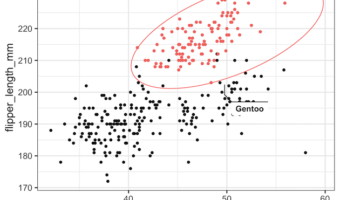
In this tutorial, we will learn how to annotate or highlight a specific cluster/group in R using ggplot2. We can use R package ggforce to annotate a select group as a circle or ellipse on a scatter plot. In this example, we will use geom_mark_ellipse() function to highlight a … [Read more...] about How to Annotate a Specific Cluster or Group in ggplot2

Filed Under: ggplot2, R Tagged With: ggplot add annotation

Primary Sidebar

Python & R Viz Hubs

  • Seaborn Guide & Cookbook
  • ggplot2 Guide & Cookbook
  • Matplotlib Guide & Cookbook
  • Confusion Matrix Calculator
  • Visualizing Activation Functions
  • Visualizing Dropout
  • Visualizing Loss Functions

Buy Me a Coffee

Copyright © 2026 · Daily Dish Pro on Genesis Framework · WordPress · Log in

Go to mobile version