• Skip to primary navigation
  • Skip to main content
  • Skip to primary sidebar

Data Viz with Python and R

Learn to Make Plots in Python and R

  • Home
  • Seaborn
  • Matplotlib
  • ggplot2
  • Altair
  • About
    • Privacy Policy
  • Visualizing Activation Functions in Neural Networks
  • Confusion Matrix Calculator
  • Visualizing Dropout Rate in Neural Network
  • Visualizing Loss Functions in Neural Networks
  • Show Search
Hide Search

Correlation as network plot

Visualizing Correlation with tidymodels’ corrr package

datavizpyr · August 18, 2022 ·

Correlation Network plot with corrr package

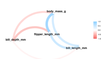
In this tutorial, we will learn examples of computing correlations among all the numerical variables in a dataframe and visualize the correlation in multiple ways. We will use Corrr package from tidymodels to compute the correlation and visualize the correlation. corrr is … [Read more...] about Visualizing Correlation with tidymodels’ corrr package

Filed Under: ggplot2, R Tagged With: Correlation as network plot, correlation plot with corrr, corrr package

Primary Sidebar

Python & R Viz Hubs

  • Seaborn Guide & Cookbook
  • ggplot2 Guide & Cookbook
  • Matplotlib Guide & Cookbook
  • Confusion Matrix Calculator
  • Visualizing Activation Functions
  • Visualizing Dropout
  • Visualizing Loss Functions

Buy Me a Coffee

Copyright © 2026 · Daily Dish Pro on Genesis Framework · WordPress · Log in

Go to mobile version