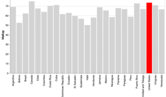
Bar charts are a simple visualization that plots a quantitative variable corresponding to categorical variable as bars. Sometimes we might want to highlight a specific bar in barplot with different color compared to the rest. In this post, we will see examples of * How to Make a … [Read more...] about How To Highlight a Bar in Bar Chart in Altair?
barplot
How To Highlight a Bar in Barplot in R?

Sometimes while making a barplot, you might like to highlight a single bar in different color when compared to other bars. In this post, we will learn how to highlight a bar in barplot using ggplot2 in R. A Barplot displays counts or some quantitative variable corresponding to … [Read more...] about How To Highlight a Bar in Barplot in R?
How To Make Barplots with Error bars in ggplot2?

In this post, we will learn how to make a barplot with error bar using ggplot2 in R. Barplot alone is useful to display counts for multiple categories. However, often there may be uncertainty around the count values and we could represent as error bar on the barplot. Let us … [Read more...] about How To Make Barplots with Error bars in ggplot2?
Matplotlib Bar Plot in Python: Sort (Asc/Desc), Add Labels, Colors, Currency Axis & Horizontal Bars
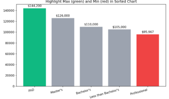
Why Sorting and Customizing Bar Plots Matters? Most bar charts need two upgrades to be useful: (1) put the categories in a meaningful order (ascending/descending), and (2) add polish (value labels, colors, readable axes, or horizontal layout for long names). This tutorial shows … [Read more...] about Matplotlib Bar Plot in Python: Sort (Asc/Desc), Add Labels, Colors, Currency Axis & Horizontal Bars
Coloring Barplots with ggplot2 in R
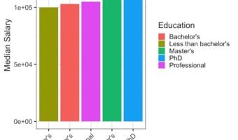
In this tutorial, we will see examples of making barplots and coloring the barplots in a few simple ways. We will see how to color barplots manually by specifying a color of interest and how to color a barplot by another variable in the dataset. Let us load tidyverse suite of … [Read more...] about Coloring Barplots with ggplot2 in R