• Skip to primary navigation
  • Skip to main content
  • Skip to primary sidebar

Data Viz with Python and R

Learn to Make Plots in Python and R

  • Home
  • Seaborn
  • Matplotlib
  • ggplot2
  • Altair
  • About
    • Privacy Policy
  • Visualizing Activation Functions in Neural Networks
  • Confusion Matrix Calculator
  • Visualizing Dropout Rate in Neural Network
  • Visualizing Loss Functions in Neural Networks
  • Show Search
Hide Search

add percentage with scales

How to make stacked barplot with percent on x/y axis

datavizpyr · August 19, 2022 ·

Stacked bar plot with percentage on y-axis

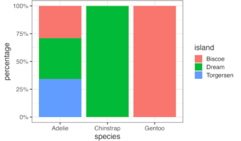
In this post we will see how to make a stacked barplot showing percentage on its axis instead of count or proportion. We can make stacked barplot with count or proportion directly using geom_bar() function in ggplot2. Then we will use scales R package to add percentage on the … [Read more...] about How to make stacked barplot with percent on x/y axis

Filed Under: ggplot2, R Tagged With: add percentage with scales, stacked barplot with percentage

Primary Sidebar

Python & R Viz Hubs

  • Seaborn Guide & Cookbook
  • ggplot2 Guide & Cookbook
  • Matplotlib Guide & Cookbook
  • Confusion Matrix Calculator
  • Visualizing Activation Functions
  • Visualizing Dropout
  • Visualizing Loss Functions

Buy Me a Coffee

Copyright © 2026 · Daily Dish Pro on Genesis Framework · WordPress · Log in

Go to mobile version