• Skip to primary navigation
  • Skip to main content
  • Skip to primary sidebar

Data Viz with Python and R

Learn to Make Plots in Python and R

  • Home
  • Seaborn
  • Matplotlib
  • ggplot2
  • Altair
  • About
    • Privacy Policy
  • Visualizing Activation Functions in Neural Networks
  • Confusion Matrix Calculator
  • Visualizing Dropout Rate in Neural Network
  • Visualizing Loss Functions in Neural Networks
  • Show Search
Hide Search

add percentage labels barplot

How to add percentage label on bars in barplot with ggplot2

datavizpyr · December 31, 2021 ·

How to add labels with percentage symbols on barplots in ggplot2

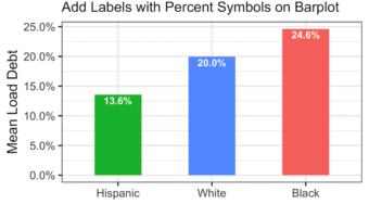
Adding percentage labels or count labels to bars in a barplot can help read the barplot quickly. In this tutorial, we will learn how to add labels with percentage symbol on bars in a barplot made with ggplot2 in R. Loading Packages and Dataset Let us get started by loading … [Read more...] about How to add percentage label on bars in barplot with ggplot2

Filed Under: barplot ggplot2, R Tagged With: add percentage labels barplot

Primary Sidebar

Python & R Viz Hubs

  • Seaborn Guide & Cookbook
  • ggplot2 Guide & Cookbook
  • Matplotlib Guide & Cookbook
  • Confusion Matrix Calculator
  • Visualizing Activation Functions
  • Visualizing Dropout
  • Visualizing Loss Functions

Buy Me a Coffee

Copyright © 2026 · Daily Dish Pro on Genesis Framework · WordPress · Log in

Go to mobile version