• Skip to primary navigation
  • Skip to main content
  • Skip to primary sidebar

Data Viz with Python and R

Learn to Make Plots in Python and R

  • Home
  • Python Viz
  • Seaborn
  • Altair
  • R Viz
  • ggplot2
  • About
    • Privacy Policy
  • Show Search
Hide Search

add p-value to plot in R

How to Annotate a plot with P-value in ggplot2

datavizpyr · August 30, 2024 ·

Annotate a plot with p-value from linear regression model in ggplot2: Example 2

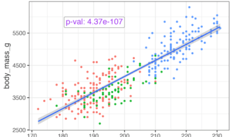
In this tutorial, we will learn how to add statistical significance to a plot made with ggplot2. Let us we have scatterplot to help understand the relation between two numerical variables and we have done linear regression analysis to find the statisitical significance of the … [Read more...] about How to Annotate a plot with P-value in ggplot2

Filed Under: ggplot2, ggtext, R Tagged With: add annotation with ggtext, add p-value to plot in R

Primary Sidebar

Tags

Altair barplot Boxplot boxplot python boxplot with jiitered text labels Bubble Plot Color Palette Countplot Density Plot Facet Plot gganimate ggplot2 ggplot2 Boxplot ggplot2 error ggplot boxplot ggridges ggtext element_markdown() Grouped Barplot R heatmap heatmaps Histogram Histograms Horizontal boxplot Python lollipop plot Maps Matplotlib Pandas patchwork pheatmap Pyhon Python R RColorBrewer reorder boxplot ggplot Ridgeline plot Scatter Plot Scatter Plot Altair Seaborn Seaborn Boxplot Stock Price Over Time Stripplot UpSetR Violinplot Violin Plot World Map ggplot2

Buy Me a Coffee

Copyright © 2025 · Daily Dish Pro on Genesis Framework · WordPress · Log in

Go to mobile version