Matplotlib is one of the most popular plotting libraries in Python. As the name kind of hints, Matplotlib is bases on MATLAB style interface offers powerful functions to make versatile plots with Python.
In this post, we will see examples of simple scatter plot with Matplotlib’s module pyplot. Let us first load the libraries needed.
Let us load matplotlibs’ pyplot as plt.
import matplotlib.pyplot as plt
import pandas as pd
import numpy as np
Let us generate some data and store it in Pandas dataframe. We will generate the data using NumPy’s random module.
n = 100
# Generate Data to make scatter plot
df = pd.DataFrame({
    'Height': np.random.normal(160, 10, n),
    'Weight': np.random.normal(130, 10, n)})
Our dataframe contains two randomly generated numerical variables, Height and Weight.
df.head()

	Height	Weight
0	159.121370	131.329337
1	168.002791	136.745152
2	180.632360	141.578148
3	155.182268	122.819931
4	171.835512	148.494374
Scatter Plot with pyplot’s plot() function
At first we will use pyplot’s plot() function. To make scatter plot using plot() function, we provide the two variables needed and the marker symbol. In this example we use circle marker.
plt.plot('Height','Weight','o',data=df)
Note that, we can directly provide the data as two variables to plot() function, instead of a data frame with variables.
We get a simple scatter plot. Although plot() function has made a nice scatter plot, it is at bare minimum without any labels for x and y axes.

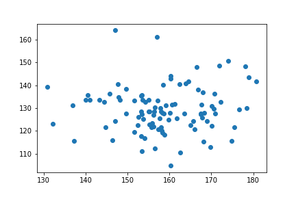
Scatter Plot with pyplot’s scatter() function
The second way we can make scatter plot using Matplotlib’s pyplot is to use scatter() function in pyplot module.
Just as before, we provide the variables we needed to the scatter function with the data frame containing the variables.
plt.scatter('Height','Weight',data=df)
The scatter plot we get is identical to the one we got using the plot() function. This scatter plot also does not have any labels on x and y axes. Although we have not illustrated here, pyplot’s scatter() function is more sophisticated in plotting scatter plots than the plot() function.
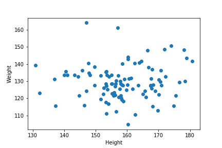
How To Add Labels to Plot made using Matplotlib in Python?
We will see use cases of other functionalities of scatter() function in later posts. In this example, let us add labels to both x and y-axes.
We use xlabel() and ylabel() function the plt object to add the labels for x and y axes.
plt.scatter('Height','Weight',data=df)
plt.xlabel("Height")
plt.ylabel("Weight")
Now the simple scatter plot made using Matplotlib’s pyplot has labels and it is definitely more functional.