• Skip to primary navigation
  • Skip to main content
  • Skip to primary sidebar

Data Viz with Python and R

Learn to Make Plots in Python and R

  • Home
  • Seaborn
  • Matplotlib
  • ggplot2
  • Altair
  • About
    • Privacy Policy
  • Visualizing Activation Functions in Neural Networks
  • Confusion Matrix Calculator
  • Visualizing Dropout Rate in Neural Network
  • Visualizing Loss Functions in Neural Networks
  • Show Search
Hide Search

Simple Scatter Plot in R with ggplot2

datavizpyr · December 11, 2019 ·

Last updated on December 15, 2019

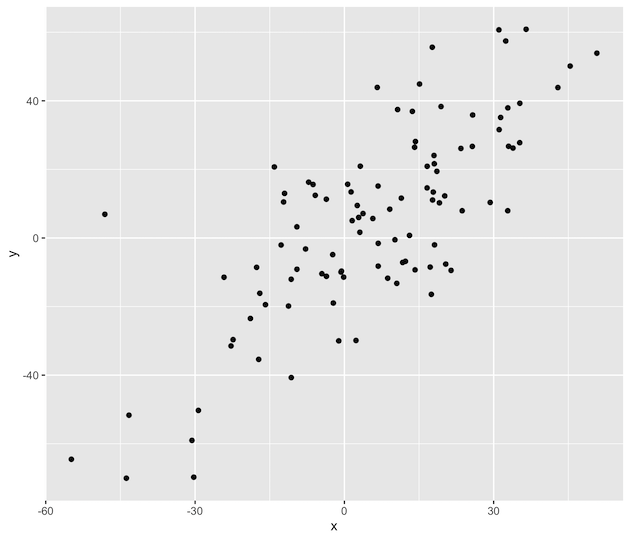
Scatter plot is a great data visualization tool to visualize relationship between two quantitative variables. We will see an example to make a simple scatter plot in R with ggplot2. Let us first load the ggplot2 package.
library(tidyverse)
Let us create a data set and store it in a data frame.
set.seed(42)
x <- rnorm(100, mean=5, sd=20)
y <- x + rnorm(100, mean=1, sd=20)
df <- data.frame(x=x, y=y)
Let us use the above dataframe to make scatter plot with ggplot2 in R. In ggplot2, geom_point() function helps us make scatter plot. After defining the aesthetics for ggpot2, we can add geom_point() to make scatter plot.
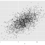
df %>%
   ggplot(aes(x=x,y=y)) + geom_point()
Here we have the simple scatter plot that we just made.
Simple Scatter Plot in R with ggplot2
Are you making a scatter plot with a lots of data points? Then your scatter plot might suffer from overplotting. Check out this post Scatter plots with transparent data points to make a better scatter plot without overplotting.

Explore the Complete ggplot2 Guide

35+ tutorials with code: scatterplots, boxplots, themes, annotations, facets, and more—tested and beginner-friendly.

Visit the ggplot2 Hub → No fluff—just code and visuals.

Related posts:

Scatter Plot with Transparent Data PointsScatter Plot with Transparent Points Using ggplot2 in R Scatter Plot R: Fill color by variableHow To Color Scatter Plot by Variable in R with ggplot2? Customizing Labels on Bars in Side by side Stacked BarplotHow To Add Labels to Grouped Barplot with Bars Side-By-Side in R? Visualizing Missing Data with Barplot in R ggplot2Visualizing Missing Data with Barplot in R

Filed Under: ggplot2, R, Scatter Plot ggplot2 Tagged With: R, Scatter Plot

Primary Sidebar

Python & R Viz Hubs

  • Seaborn Guide & Cookbook
  • ggplot2 Guide & Cookbook
  • Matplotlib Guide & Cookbook
  • Confusion Matrix Calculator
  • Visualizing Activation Functions
  • Visualizing Dropout
  • Visualizing Loss Functions

Buy Me a Coffee

Copyright © 2026 · Daily Dish Pro on Genesis Framework · WordPress · Log in

Go to mobile version