• Skip to primary navigation
  • Skip to main content
  • Skip to primary sidebar

Data Viz with Python and R

Learn to Make Plots in Python and R

  • Home
  • Seaborn
  • Matplotlib
  • ggplot2
  • Altair
  • About
    • Privacy Policy
  • Visualizing Activation Functions in Neural Networks
  • Confusion Matrix Calculator
  • Visualizing Dropout Rate in Neural Network
  • Visualizing Loss Functions in Neural Networks
  • Show Search
Hide Search

Side by side plots with ggplot2 using gridExtra

datavizpyr · September 13, 2021 ·

In this tutorial, we will learn how to place two plots made with ggplot2 side by side. In R, we have multiple solutions to combine plots into a single plot. Here, we will use R Package gridExtra’s function grid.arrange to combine two plots side by side.

Firs, let us load the packages needed and palmer penguin dataset to make two plots separately.

library(tidyverse)
library(palmerpenguins)
theme_set(theme_bw(16))

Our data looks like this.

head(penguins)

## # A tibble: 6 x 8
##   species island bill_length_mm bill_depth_mm flipper_length_… body_mass_g sex  
##   <fct>   <fct>           <dbl>         <dbl>            <int>       <int> <fct>
## 1 Adelie  Torge…           39.1          18.7              181        3750 male 
## 2 Adelie  Torge…           39.5          17.4              186        3800 fema…
## 3 Adelie  Torge…           40.3          18                195        3250 fema…
## 4 Adelie  Torge…           NA            NA                 NA          NA <NA> 
## 5 Adelie  Torge…           36.7          19.3              193        3450 fema…
## 6 Adelie  Torge…           39.3          20.6              190        3650 male 
## # … with 1 more variable: year <int>

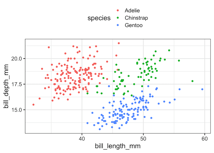
Let is make a scatter plot and store the plot in a variable. Here we have made a scatter plot with legend on top of the plot such that the values of the legend is arranged in a single column.

p1 <- penguins %>% 
  ggplot(aes(x=bill_length_mm, bill_depth_mm, color=species))+
  geom_point()+
  theme(legend.position="top")+
  guides(color=guide_legend(ncol=1))
p1
How to combine two plots side by side?

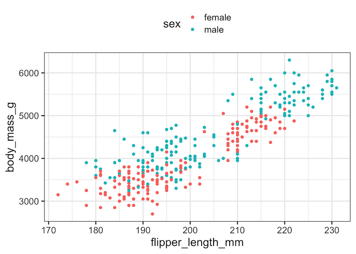
Let us make second plot that we want to combine with the first plot we made.

p2 <- penguins %>% 
  drop_na() %>%
  ggplot(aes(x=flipper_length_mm, body_mass_g, color=sex))+
  geom_point()+theme(legend.position = "top")+
  guides(color=guide_legend(ncol=1))
p2

How to combine two ggplots side by side?

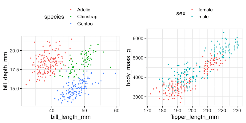
Now we have two plots ready and we can use gridExtra’s grid.arrange() function to combine the two plots. To place the plots side by side, we specify the number of columns to be “2”.

gridExtra::grid.arrange(p1,p2, ncol=2)
Combine two plots made with ggplot2 side by side using gridExtra

Explore the Complete ggplot2 Guide

35+ tutorials with code: scatterplots, boxplots, themes, annotations, facets, and more—tested and beginner-friendly.

Visit the ggplot2 Hub → No fluff—just code and visuals.

Related posts:

Customizing Mean mark to boxplot with ggplot2How To Show Mean Value in Boxplots with ggplot2? Scatterplot with marginal multi-histogram with ggExtraHow To Make Scatterplot with Marginal Histograms in R? ggforce geom_circle(): Annotate with a circleHow To Annotate a Plot with Circle in R Default ThumbnailHow to Make Axis Text Bold in ggplot2

Filed Under: ggplot2, R Tagged With: gridExtra grid.arrange, side by side plot ggplot2

Primary Sidebar

Python & R Viz Hubs

  • Seaborn Guide & Cookbook
  • ggplot2 Guide & Cookbook
  • Matplotlib Guide & Cookbook
  • Confusion Matrix Calculator
  • Visualizing Activation Functions
  • Visualizing Dropout
  • Visualizing Loss Functions

Buy Me a Coffee

Copyright © 2026 · Daily Dish Pro on Genesis Framework · WordPress · Log in

Go to mobile version