Last updated on August 22, 2025
One of the challenges in making data visualization is making all aspects of a plot clearly visible. Often, you might see where the axis labels, tick labels are too small and not legible at all. Challenge is that the required sizes of plot aspects like labels, points, lines are not easy to set for different kind of media where the plot will be used. For example, plots used in a talk the label size should be different from the plots to be used in a poster.
👉 Want more? Explore the full Seaborn Tutorial Hub with 35+ examples, code recipes, and best practices.
Adjust plot sizes in Seaborn
Seaborn’s set_context() function offers a great solution to solve the problem. With set_context(), one can specify the plotting context and adjust the size of labels and lines automatically.
Let us see examples of using Seaborn’s set_context() and adjust the sizes for a plot be used in a notebook, talk and poster.
Let us load the libraries needed.
import matplotlib.pyplot as plt
import pandas as pd
import seaborn as sns
We will use the Penguins data set to make the plot for different contexts.
penguins_data="https://raw.githubusercontent.com/datavizpyr/data/master/palmer_penguin_species.tsv"
Let us load the data directly from github page.
penguins_df = pd.read_csv(penguins_data, sep="\t")
penguins_df.head()
Seaborn Scatterplot with default plot size
Let us make a scatterplot using Seaborn’s scatterplot function, but without setting a context for plot.
plt.figure(figsize=(10,8))
scatter_plot = sns.scatterplot(x="culmen_length_mm",
                y="flipper_length_mm",
                hue="species",
                style="sex",
                data=penguins_df)
plt.xlabel("Culmen Length (mm)")
plt.ylabel("Flipper Length (mm)")
plt.savefig("Seaborn_scatterplot.png",
                    format='png',dpi=150)
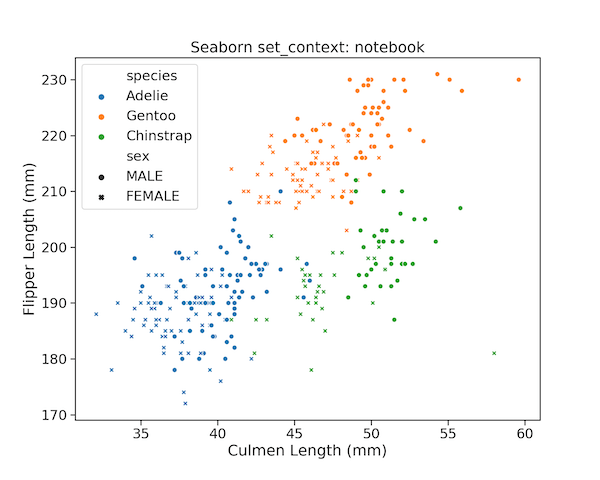
Seaborn set_context(): plot size suitable for notebook
Depending on the context of use, we might need to make the labels bigger. To make the plot for using in a notebook setting, we can use set_context() function with “notebook” as argument. In addition, we can also specify font_scale argument.
sns.set_context("notebook", font_scale=1.5)
The scatterplot made after setting the context will have the label size, lines and point size set for “notebook”.
plt.figure(figsize=(10,8))
sns.scatterplot(x="culmen_length_mm",
                y="flipper_length_mm",
                hue="species",
                style="sex",
                data=penguins_df)
plt.xlabel("Culmen Length (mm)")
plt.ylabel("Flipper Length (mm)")
plt.title("Seaborn set_context: notebook")
plt.savefig("set_context_notebook_Seaborn_scatterplot.png",
                    format='png',dpi=150)
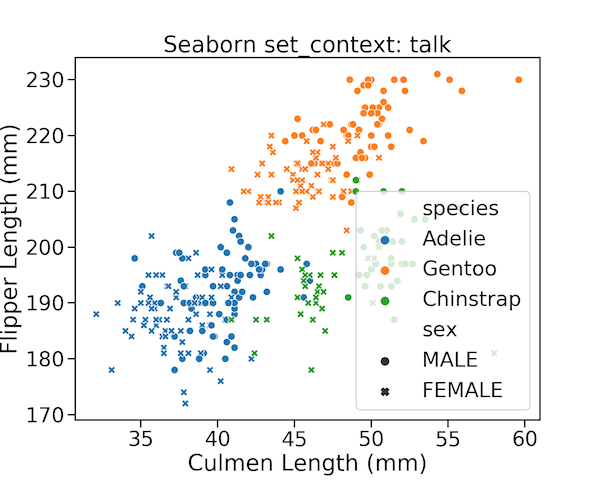
Seaborn set plotting context for slides/talks
Similarly, if you want to use the data visualization in a slide/talk, we can use set_context() with “talk” argument.
sns.set_context("talk", font_scale=1.5)
We can see that sizes of labels, legends, data points are bigger than before.
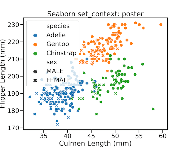
Seaborn set plotting context for poster
If you you are going to use the plot in a poster, where you might need the labels and other aspects of the plot really bigger to be legible, we can use set_context() with “poster” argument.
sns.set_context("poster", font_scale=1.1)
And we would get a plot suitable for using it in poster.