Adding regression line to scatter plot can help reveal the relationship or association between the two numerical variables in the scatter plot. With ggplot2, we can add regression line using geom_smooth() function as another layer to scatter plot. In this post, we will see examples of adding regression lines to scatterplot using ggplot2 in R.
Let us load tidyverse suite of packages.
library(tidyverse)
We will use the Broadway data set from TidyTuesday project.
grosses < readr::read_csv('https://raw.githubusercontent.com/rfordatascience/tidytuesday/master/data/2020/2020-04-28/grosses.csv')
Our data looks like this with weekly gross for each Broadway play since 1985.
head(grosses)
## # A tibble: 6 x 14
##   week_ending week_number weekly_gross_ov… show  theatre weekly_gross
##   <date>            <dbl>            <dbl> <chr> <chr>          <dbl>
## 1 1985-06-09            1          3915937 42nd… St. Ja…       282368
## 2 1985-06-09            1          3915937 A Ch… Sam S.…       222584
...
## # … with 8 more variables: potential_gross <lgl>, avg_ticket_price <dbl>,
## #   top_ticket_price <lgl>, seats_sold <dbl>, seats_in_theatre <dbl>,
## #   pct_capacity <dbl>, performances <dbl>, previews <dbl>
Let us compute total weekly gross for all plays in a week and the total number of seats sold for all plays in the week. We will first group by week and then use summarize to compute total gross and seats sold.
df <- grosses %>%
  group_by(week_ending)%>%
  summarize(gross=sum(weekly_gross), seats=sum(seats_sold))
Our summarized dataframe looks like this and we will use this data to make scatter plot with regression line.
head(df)

## # A tibble: 6 x 3
##   week_ending   gross  seats
##   <date>        <dbl>  <dbl>
## 1 1985-06-09  3915937 132214
## 2 1985-06-16  3685742 127655
## 3 1985-06-23  3690242 124925
## 4 1985-06-30  3986642 131832
## 5 1985-07-07  2929052 103784
## 6 1985-07-14  3072770 108076
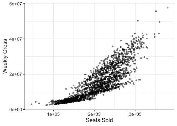
Let us first make a simple scatter plot between the seats sold and the total gross
df %>%
  ggplot(aes(x=seats,y=gross)) +
  geom_point(alpha=0.5) +
  labs(x= "Seats Sold", y="Weekly Gross")
We can see association between the two variables gross and seats; gross increasing with total seats sold.
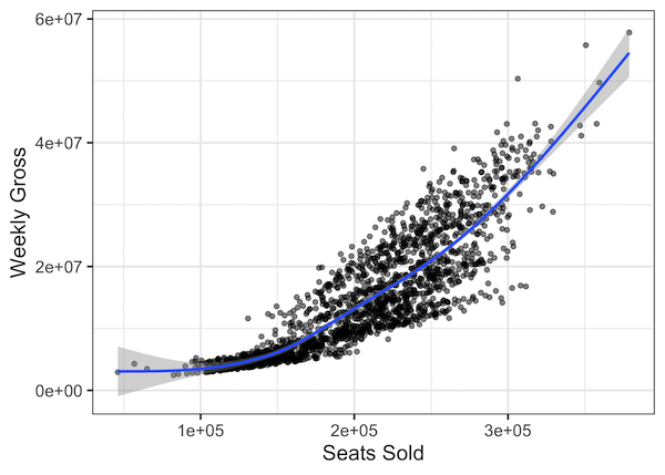
Let us add regression line to the scatter plot using geom_smooth() function by adding it as one more layer to ggplot2 plot. Here we have just added geom_smooth() to scatter plot function.
df %>%
  ggplot(aes(x=seats,y=gross)) +
  geom_point(alpha=0.5) +
  labs(x= "Seats Sold", y="Weekly Gross")+
  geom_smooth()
By default, geom_smooth() function adds regression line using one of the methods available “lm”, “lowess”, and “gam”. geom_smooth() chooses a smoothing method based ont he size of the data. For example, geom_smooth() uses loess() if the data size is less 1,000 observations. Our data contains more than 1000 observation, so it uses gam() by default. It also adds standard error to the smoothed line on the scatter plot.
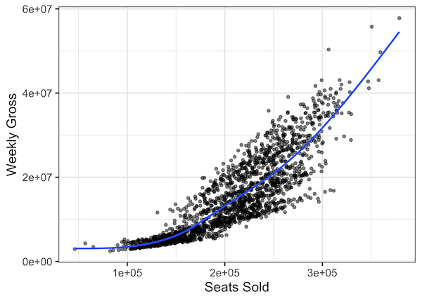
We can make the scatterplot with regression line but not with standard error using se=FALSE as argument to geom_smooth() function.
df %>%
  ggplot(aes(x=seats,y=gross)) +
  geom_point(alpha=0.5) +
  labs(x= "Seats Sold", y="Weekly Gross")+
  geom_smooth(se=FALSE)
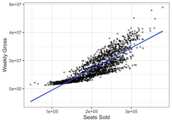
In the above scatterplots we have the regression line from GAM model. We can specify the method for adding regression line using method argument to geom_smooth(). For example, we can add a line from simple linear regression model using “method=lm” argument.
df %>%
  ggplot(aes(x=seats,y=gross)) +
  geom_point(alpha=0.5) +
  labs(x= "Seats Sold", y="Weekly Gross")+
  geom_smooth(method=lm)
For this data it is clear that “method=lm” is not the best fit line.