• Skip to primary navigation
  • Skip to main content
  • Skip to primary sidebar

Data Viz with Python and R

Learn to Make Plots in Python and R

  • Home
  • Python Viz
  • Seaborn
  • Altair
  • R Viz
  • ggplot2
  • About
    • Privacy Policy
  • Show Search
Hide Search

Scatter Plot with Regression Line using Altair in Python

datavizpyr · December 15, 2019 ·

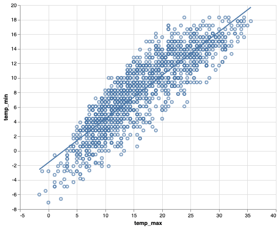
Adding regression line to scatter plot is a great way to understand the relationship between two numeric variables.

In this post, we will see an example of using Altair to make a scatter plot with regression line using real world dataset.

Let us load the packages we need. We will load Altair package and load data sets from vege_datasets.

import altair as alt
from vega_datasets import data

We will use the Seattle weather data set to make scatterplot with a linear regression line.

seattle_weather = data.seattle_weather()

Here is how the data looks like.

print(seattle_weather.head(n=3))

        date  precipitation  temp_max  temp_min  wind  weather
0 2012-01-01            0.0      12.8       5.0   4.7  drizzle
1 2012-01-02           10.9      10.6       2.8   4.5     rain
2 2012-01-03            0.8      11.7       7.2   2.3     rain

The basic idea behind making scatter plot with a regression line in Altair is to create scatter plot first using a base Altair object and then add regression line on top of it.

Let us first make a scatter plot with Altair and save it as an object.

sc_plot = alt.Chart(seattle_weather).mark_point().encode(
    x='temp_max',
    y='temp_min'
)

We can make regression line using transfor_regression() function and we can add it as another layer to the scatter plot. We need to specify which variables in our dataframe needed to be used to do the regression analysis and make regression line.

sc_plot + sc_plot.transform_regression('temp_max', 'temp_min').mark_line()

By default, Altair adds a blue regression line to the scatter plot as show below.

Scatter plot with regression line Altair

Related posts:

Faceting in AltairHow To Facet a Scatter Plot with Altair? Area Chart with Altair in PythonArea Chart with Altair in Python Highlight a bar in barplot in AltairHow To Highlight a Bar in Bar Chart in Altair? Stripplot Altair with jitterHow To Make Stripplot with Jitter in Altair Python?

Filed Under: Altair, Python, Scatter Plot Altair Tagged With: Altair, Python

Primary Sidebar

Tags

Altair barplot Boxplot boxplot python boxplot with jiitered text labels Bubble Plot Color Palette Countplot Density Plot Facet Plot gganimate ggplot2 ggplot2 Boxplot ggplot2 error ggplot boxplot ggridges ggtext element_markdown() Grouped Barplot R heatmap heatmaps Histogram Histograms Horizontal boxplot Python lollipop plot Maps Matplotlib Pandas patchwork pheatmap Pyhon Python R RColorBrewer reorder boxplot ggplot Ridgeline plot Scatter Plot Scatter Plot Altair Seaborn Seaborn Boxplot Stock Price Over Time Stripplot UpSetR Violinplot Violin Plot World Map ggplot2

Buy Me a Coffee

Copyright © 2025 · Daily Dish Pro on Genesis Framework · WordPress · Log in

Go to mobile version