Last updated on August 14, 2025
Want to smooth out erratic stock price fluctuations and spot the underlying trend? In this tutorial, you’ll learn how to compute and visualize a rolling mean (moving average) of stock prices in R using tidyquant, zoo package’s rollmean(), and ggplot2. We’ll fetch Nvidia (NVDA) stock data from 2024 and show a clean time-series plot comparing actual prices with the moving average—plus tips on choosing the right window size.
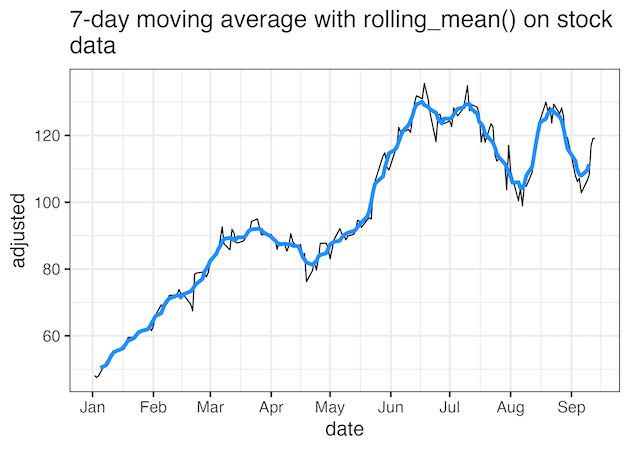
The rolling_mean() function in can compute moving average of data of interest over a window size. For example, if we want to compute 7-day moving average, we will use the window size of 7 to compute rolling mean. Such a moving average plot over the right window size can help remove noise in the data and see the existing patterns easily.
Let us load the packages needed.
library(tidyverse)
library(tidyquant)
library(zoo)
theme_set(theme_bw(16))
To download stock dataset, we will use tidyquant package. In this example we get Nvidia’s stock price data for the year 2024 so far.
start_date <- as.Date("2024-01-01")
stock_ticker <- c("NVDA")
stock_df <- tq_get(stock_ticker,
                   from = start_date,
                   to = Sys.Date())
And this is how the data looks like.
stock_df |> tail()

# A tibble: 6 × 8
  symbol date        open  high   low close    volume adjusted
  <chr>  <date>     <dbl> <dbl> <dbl> <dbl>     <dbl>    <dbl>
1 NVDA   2024-09-06  108.  108.  101.  103. 413638100     103.
2 NVDA   2024-09-09  105.  107.  104.  106. 273912000     106.
3 NVDA   2024-09-10  108.  109.  105.  108. 268283700     108.
4 NVDA   2024-09-11  109.  117.  107.  117. 441422400     117.
5 NVDA   2024-09-12  117.  121.  115.  119. 367100500     119.
6 NVDA   2024-09-13  119.  120.  118.  119. 237763200     119.
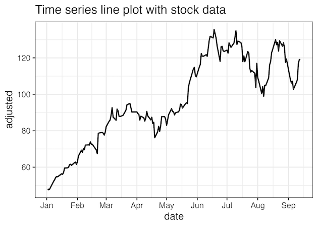
We will use “adjusted” stock price to make line plot with ggplot2’s geom_line() function.
stock_df |>
  ggplot(aes(x=date, y=adjusted))+
  geom_line( size=1)+
  scale_x_date(breaks=scales::breaks_pretty(n=10))+
  labs(title="Time series line plot with stock data")
ggsave("time_series_line_plot_with_stock_data.png")
Compute moving averages with rolling_mean() function
Here we use rolling_mean() function to compute 7-day moving average of the stock data. Notice the NA values at the top of the dataframe and this is due to the lack of data to compute moving average for the given window size.
# Calculate weekly rolling mean
stock_df <- stock_df %>%
  mutate(rolling_mean_w = zoo::rollmean(adjusted,
                                        k = 7,
                                        fill = NA))

stock_df |>head()


# A tibble: 6 × 9
  symbol date        open  high   low close    volume adjusted rolling_mean_w
  <chr>  <date>     <dbl> <dbl> <dbl> <dbl>     <dbl>    <dbl>          <dbl>
1 NVDA   2024-01-02  49.2  49.3  47.6  48.2 411254000     48.2           NA
2 NVDA   2024-01-03  47.5  48.2  47.3  47.6 320896000     47.6           NA
3 NVDA   2024-01-04  47.8  48.5  47.5  48.0 306535000     48.0           NA
4 NVDA   2024-01-05  48.5  49.5  48.3  49.1 415039000     49.1           50.4
5 NVDA   2024-01-08  49.5  52.3  49.5  52.3 642510000     52.2           51.3
6 NVDA   2024-01-09  52.4  54.3  51.7  53.1 773100000     53.1           52.3
We plot the moving average data and the original data on the same plot.
stock_df |>
  ggplot(aes(x=date, y=adjusted))+
  geom_line()+
  geom_line(aes(x=date, y=rolling_mean_w),
            color="dodgerblue",
            size=1.5,
            align="left")+
  scale_x_date(breaks=scales::breaks_pretty(n=10))+
  labs(title=stringr::str_wrap("7-day moving average with rolling_mean() on stock data",
                               width=50))
ggsave("stock_data_7day_moving_average_lineplot_ggplot2.png")
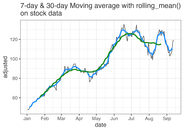
Adding multiple moving average line plots
Let us compute moving average of a bigger window size to understand the effect of choosing a window size. Here we choose a window size of 30 to compute rolling mean().
# add monthly rolling mean
stock_df <- stock_df %>%
  mutate(rolling_mean_m = zoo::rollmean(adjusted, k = 30, fill = NA))
Since the window size is larger, we have smoother version of line plot than the smaller (7-day) moving average plot.
stock_df |>
  ggplot(aes(x=date, y=adjusted))+
  geom_line(color="black")+
  geom_line(aes(x=date, y=rolling_mean_w), color="dodgerblue",size=1.5,
            align="left")+
  geom_line(aes(x=date, y=rolling_mean_m), color="green4",size=1.5,
            align="right")+
  scale_x_date(breaks=scales::breaks_pretty(n=10))+
  labs(title=stringr::str_wrap("7-day & 30-day Moving average with rolling_mean() on stock data",
                               width=50))
ggsave("stock_data_multiple_moving_averages_lineplot_ggplot2.png")
Explore the Complete ggplot2 Guide
35+ tutorials with code: scatterplots, boxplots, themes, annotations, facets, and more—tested and beginner-friendly.
Visit the ggplot2 Hub → No fluff—just code and visuals.


