Ridgeline plot is one of the data visualization techniques that is suitable for visualizing multiple distributions or changes in distributions over time or space. Claus Wilke made created this plot and a package in R to make this easily. He defines it as a partially overlapping line plots that create the impression of a mountain range.
In this post we will learn how to make ridgeline plot with the R package ggridges. The R package ggridges is a must add-on for ggplot2.
library(tidyverse)
library(ggridges)
theme_set(theme_bw())
We will use food category and CO2 emission data set from the TidyTuesday project as before to learn to make ridgeline plots. Check out the post on how to make violin plots to learn more about the dataset.
food_consumption <- readr::read_csv('https://raw.githubusercontent.com/rfordatascience/tidytuesday/master/data/2020/2020-02-18/food_consumption.csv')
head(food_consumption)
The ggridges package offeres types of geoms, geom_ridgeline() and geom_density_ridges(). geom_ridgeline() uses the height values directly to draw ridgelines and geom_density_ridges() estimates densities and then makes ridgeline plot.
We will use geom_density_ridges() function to make ridgeline plot. We can use the function like any other ggplot2 functions and add as another layer after specifying mapping.
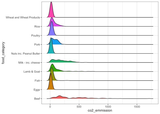
food_consumption %>%
  filter(co2_emmission>=10) %>%
  ggplot(aes(x=co2_emmission, y=food_category, fill=food_category))+
  geom_density_ridges()+
  theme(legend.position = "none")
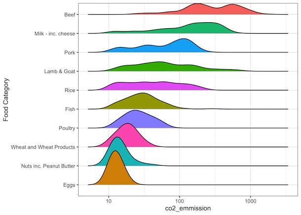
How to Make Ridgeline plot with log-scale on x-axis?
We can make ridgeline plot with log-scale on axis using scale_x_continuous() function and specifying what type of transformation we need with “trans” argument. Since we want to transform the data log10, we use trans=”log10″ as argument.
food_consumption %>%
  filter(co2_emmission>=10) %>%
  ggplot(aes(x=co2_emmission, y=food_category, fill=food_category))+
  geom_density_ridges()+
  theme(legend.position = "none")+
  scale_x_continuous(trans="log10")
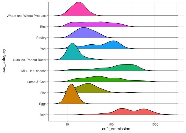
How to Order Ridgeline plot?
We will order the ridgeline plot or sort the mountains based on its mean/median using forcats’ fct_reoder() function.
food_consumption %>%
  filter(co2_emmission>=10) %>%
  ggplot(aes(x=co2_emmission,
             y=fct_reorder(food_category,co2_emmission),
             fill=food_category))+
  geom_density_ridges()+
  theme(legend.position = "none")+
  scale_x_continuous(trans="log10")+
  labs(y="Food Category")