pch in R, short for plot characters, is symbols or shapes we can use for making plots. In R, there are 26 built in shapes available for use and they can be identified by numbers ranging from 0 to 25.
The first 19 (0:18) numbers represent S-compatible vector symbols and the remaining 7 (19:25) represent the R specific vector symbols. When you make scatter plot with ggplot2, it uses a solid dot i.e. pch=16. By changing the values of pch we can change the shape of data points we use in a plot.
It is difficult to remember the pch numbers for each shape. In this post, we will see how to make a plot showing the pch number and its corresponding symbols using ggplot2. A handy plot on your table can be extremely useful in picking the right shape for your plot.
R has 26 built in shapes that are identified by numbers. There are some seeming duplicates: for example, 0, 15, and 22 are all squares. The difference comes from the interaction of the colour and fill aesthetics. The hollow shapes (0–14) have a border determined by colour; the solid shapes (15–20) are filled with colour; the filled shapes (21–24) have a border of colour and are filled with fill.
library(tidyverse)
theme_set(theme_bw(16))
Let us make a grid plot with pch and its number on the grid. To make such a plot, let us create a dataframe with pch numbers and x/y co-ordinates for each pch number. In this plot we also fix the number of pchs in each row, by using n_g. This helps us create the coordinates.
n_g <- 4
pch_df <- data.frame(p=c(0:25)) %>%
  mutate(x = rep(seq_len(ceiling(n()/n_g)),
                  each = n_g,
                  length.out = n())) %>%
  group_by(x)%>%
  mutate(y=1:n())
Our data looks like this.
pch_df %>% head()
## # A tibble: 6 x 3
## # Groups:   y [2]
##       p     y     x
##   <int> <int> <int>
## 1     0     1     1
## 2     1     1     2
## 3     2     1     3
## 4     3     1     4
## 5     4     2     1
## 6     5     2     2
Naively, when we try to make a scatter plot using the pch number as shape using the x and y-coordinates we get an error.
pch_df  %>%
  ggplot(aes(x = x, y = y, shape = p),) +
  geom_point( size = 5, fill = "steelblue")
ggplot2’s error message tells us that we are trying to map a continuous variable into a shape.
Error: A continuous variable can not be mapped to shape Run `rlang::last_error()` to see where the error occurred.
If we try to conver the pch number we have into character while plotting, it will make an incomplete plot and give us an error
## Warning: The shape palette can deal with a maximum of 6 discrete values because
## more than 6 becomes difficult to discriminate; you have 26. Consider
## specifying shapes manually if you must have them.
The solution to keep them as shape is to use the ggplot2 function “scale_shape_identity()” as another layer.
pch_df  %>%
  ggplot(aes(x = x, y = y, shape = p),) +
  scale_shape_identity() +
  geom_point( size = 5, fill = "steelblue")
ggsave("pch_in_R_plotting_shapes_try1.png")
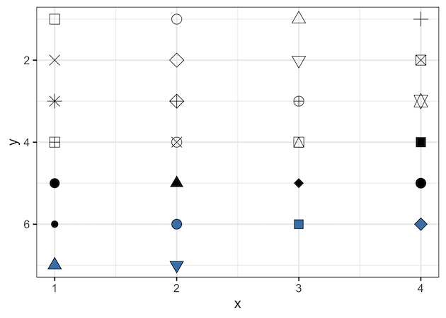
And now we get to visualize all the symbols for pch nicely.
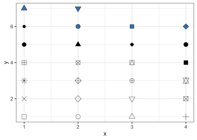
We can customize the pch plot further and make it easy to read and use. First, let us reverse the y -axis so that the low “pch” values starts at the top using ” scale_y_reverse()” function.
pch_df  %>%
  ggplot(aes(x = x, y = y, shape = p),) +
  scale_shape_identity() +
  geom_point( size = 5, fill = "steelblue") +
  scale_y_reverse()
ggsave("pch_in_R_plotting_shapes_try2.png")
Noe we get this display of pch with low pch values at bottom.
Let us annotate the plot by adding pch numbers corresponding to each pch symbol.
pch_df  %>%
  ggplot(aes(x = x, y = y, shape = p),) +
  scale_shape_identity() +
  geom_point( size = 5, fill = "steelblue")
  scale_y_reverse() +
  geom_text(aes(x = x - 0.23, y = y,
                label = paste0("pch =",p)), size = 4)
ggsave("pch_in_R_plotting_shapes_try3.png")
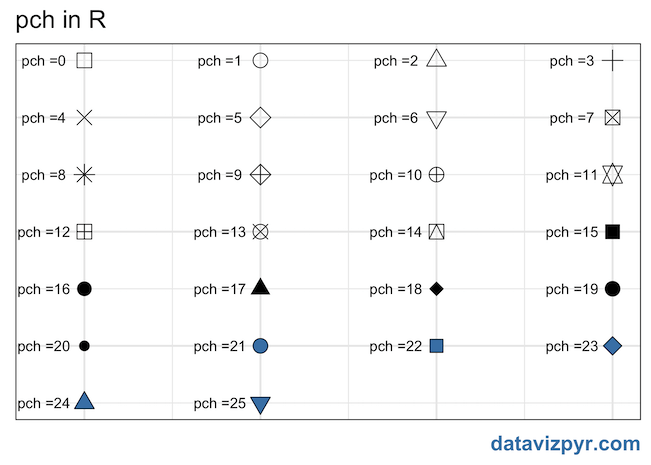
We have used geom_text() function to add the pch number right next to the shapes.
Now, let us cleanup the plot further by removing axis text and ticks.
pch_df %>%
ggplot(aes(x = x, y = y, shape = p),) +
scale_shape_identity() +
geom_point( size = 5, fill = "steelblue")
scale_y_reverse() +
geom_text(aes(x = x - 0.23, y = y,
label = paste0("pch =",p)), size = 4)+
labs(title="pch in R",
caption="datavizpyr.com")+
theme(
axis.title = element_blank(),
axis.text = element_blank(),
axis.ticks = element_blank(),
plot.caption= element_text(size=16,
color="steelblue",
face="bold")
)
ggsave("pch_in_R_plotting_shapes.png")
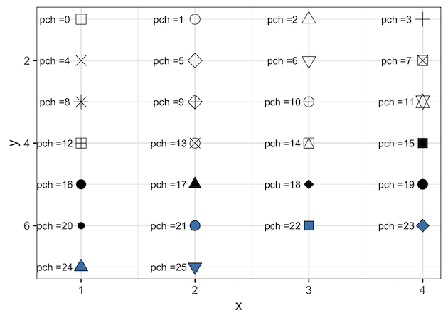
Final plot looks like this and note that only last few shapes could be filled with colors. Also as R4DS book says some symbols are duplicated
<blockquote>There are some seeming duplicates: for example, 0, 15, and 22 are all squares. The difference comes from the interaction of the colour and fill aesthetics. The hollow shapes (0–14) have a border determined by colour; the solid shapes (15–20) are filled with colour; the filled shapes (21–24) have a border of colour and are filled with fill</blockquote>